
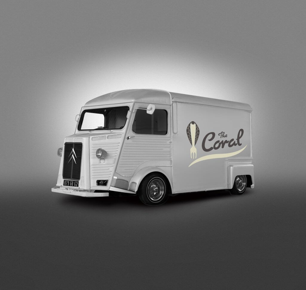
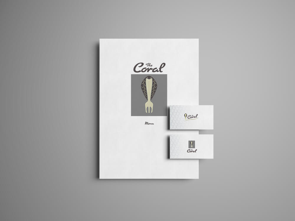
In my next exercise I was asked to provide artwork for a fish restaurant, the brief called for a modern bright contemporary design that depicted fresh ingredients and visually appetising food.
The image was to be shown at a small size but also with an option to use on a large scale on stationary and vans.
I didn’t like the idea of showing something you eat in its pre prepared/cooked form directly. It seemed a bit crude and doesn’t scream quality to me. A lot of the images I found were like this, actually depicting fish with eyes and mouths. I decided to use something more cerebral which suggested seafood. I worked up some ideas after gathering some examples of other logos, although in this case the reference seemed to steer me in the opposite direction rather than towards it. I guess that’s still a viable use of reference .
I really liked the idea of using fish scales so I explored that theme. I was quite fond of the trident idea and the fork, the trident maybe was a little bit too masculine and the brief called for bright so I decided on the fork as it was more playful.

I took the rough sketch and reproduced it in adobe illustrator. This gave me more control and accuracy over the shapes and drawing them with geometric precision. I drew half, copied it and flipped it to maintain symmetry.
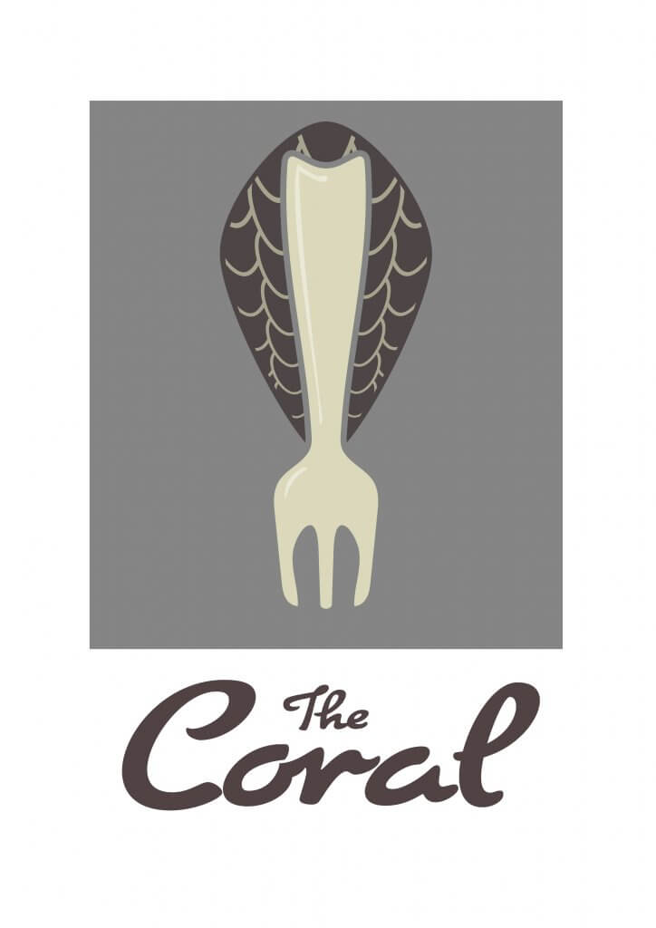
Overall I was happy with the outcome, although I would have liked to see what the trident looked like mocked up.