In this Exercise I had to design a tattoo for a friend inspired by his mother. The design also needs to work as a printed card for Mother’s Day.
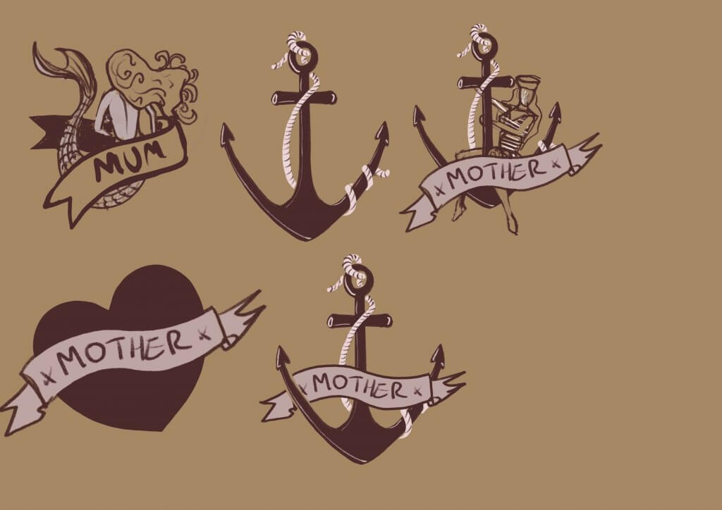
I gathered up some reference images (included below) I quite liked the nautical look, it has a great style and is classic and niche enough to not date the same way most tattoos do.
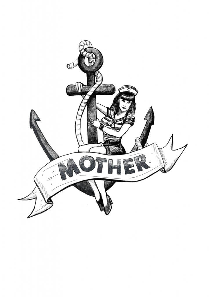
I wanted a fair amount of detail in the image, but most importantly I wanted it to have a recognisable “stamp” when viewed from a distance.

I definitely wanted to use an anchor, the anchor is a great piece of nautical imagery, but as most tattoos mean something to the wearer would also represent stability and solidarity. I liked the idea of a mother as a mermaid but in the end went for something a little more like a 50’s pin up image.

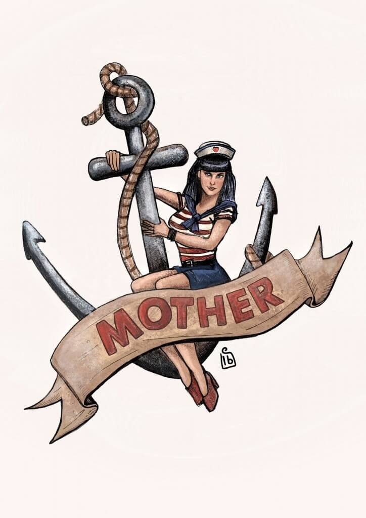
I wanted the anchor to look the same from a distance, I made that the darkest part. The banner cuts through the shape and helped to frame the main focus. I added some colour, I wanted to keep it warm and classic looking to keep with the theme. Here is the colour version.

I was happy with the results, I wanted a classic pin up Gil Elvgren or Rockwell theme to it, I came close enough.
