This task called for some research on different characters and producing my own original one.
I collected up some interesting groups using Pinterest boards, from there I decided on creating a space pirate type character.
I made a list of some pirate costume/characteristics;
- Parrots
- Eyepatches
- Waistcoats
- Long Coats
- Boots
- Guns
- Swords
- Tricorn Hats
- Wooden Leg
The next thing was to try to give to a sci fi spin, on this list I had;
- Space suit
- Lasers
- Hard Shell Flight Suit
- Breathing Apparatus
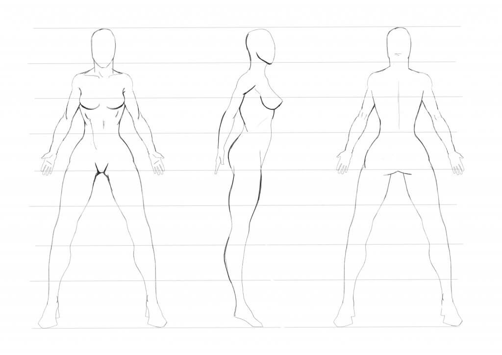
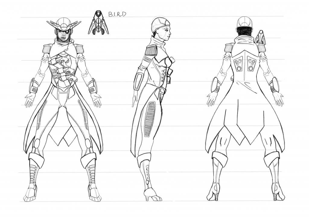
Next I drew a blank figure from the front, side and back.
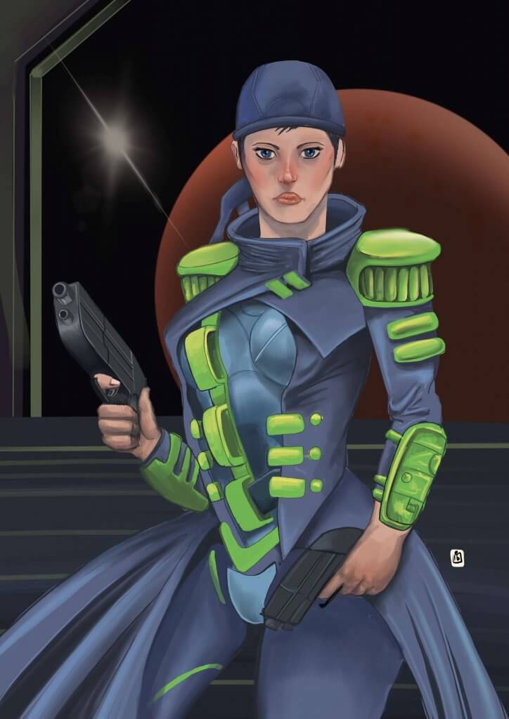
I worked up in layers, first was the hard shell structured pressurised suit, then the coat. I wanted some of the coat to be hard and some soft, the shoulder pads were to be hard and almost like armour. The pirate boots normally fold over, I tried to make that effect but shape it a little to make it more interesting, these would be hard shell too. The hair was covered in a hard helmet which echoed a bandana.
The pirate is nearly always depicted with a parrot on his shoulder. My parrot was a droid, and would act as a life support system and reconnaissance drone, I named it B.I.R.D, Biologically Integrated Reconnaissance Drone. This would eventually become a tricorn hat, the hat would generate a breathable atmosphere and also an augmented eyepiece, which would look like a pirate eye patch.
I was happy I had captured a pirate essence with a modern twist..
Here are the first designs.
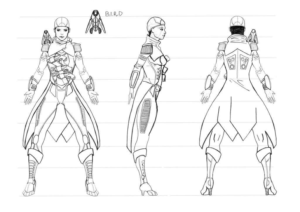
And with the Tricorn/B.I.R.D hat.
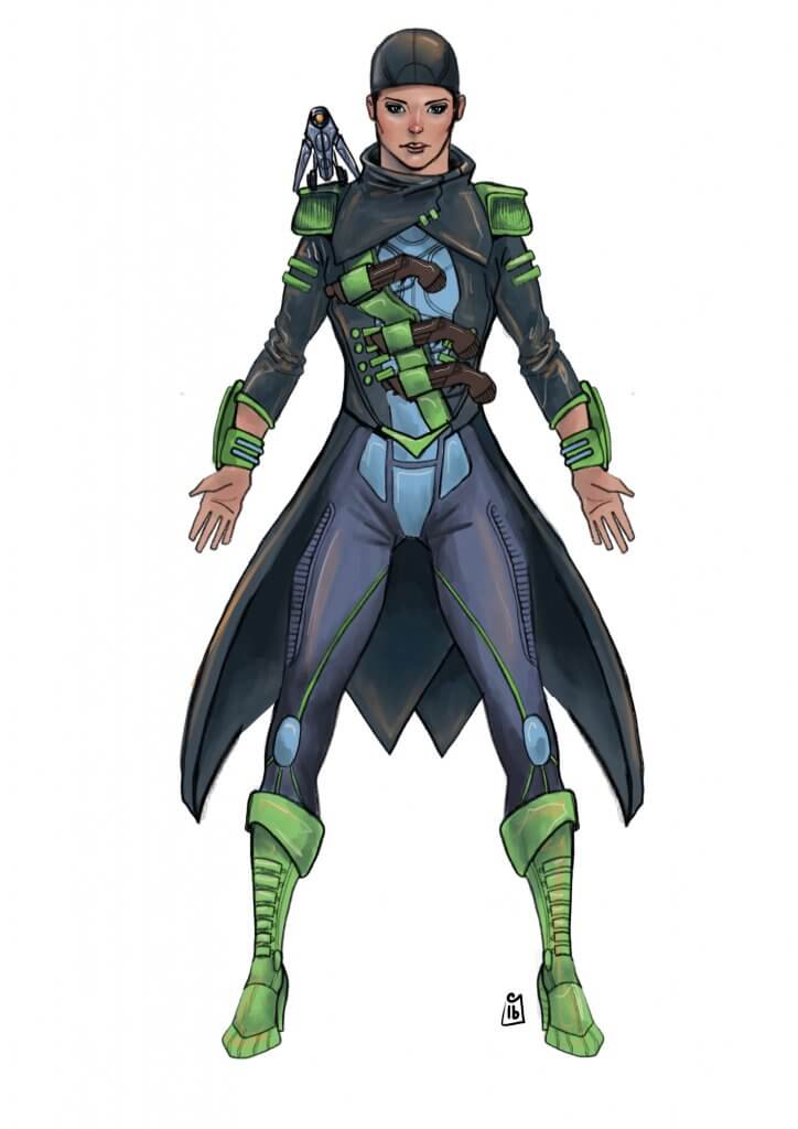
When it came to adding colours I didn’t want to look like the traditional dark colours of a pirate, black browns and reds, I wanted dark colours still as she was a pirate and therefore a bit of a rogue. I decided to use the opposite of red on the colour wheel as a jump off point. The old comics always used secondary and tertiary colours for the bad guys, to give them a less than heroic look. I like the way green works with purple, and to soften it up I used a blue, both these colours are used in the colour mix, so it seemed to be a good choice. I chose a lighter tint almost a blue grey. I was quite happy with these colours but thought I’d try some more colour ways.
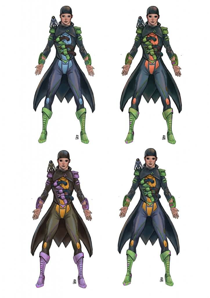
I liked the green so I explored this further with some orange accents and then more of a yellow. After that I took the complementary colour of yellow and added purple. I partnered this with brown. I still preferred my original, I decided to move forward with a concept piece.
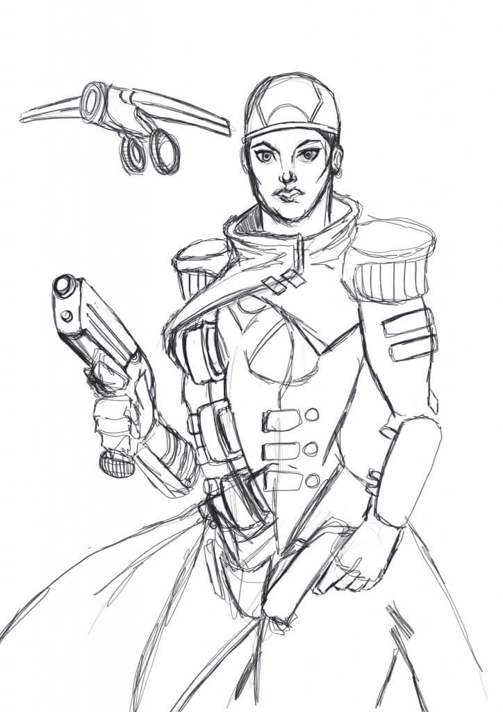
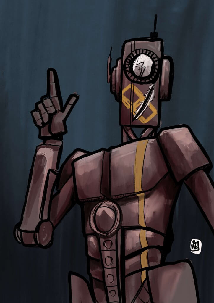
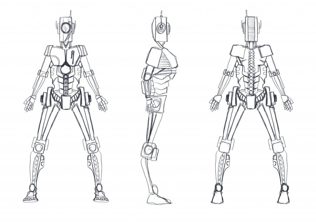
For the next character I had to do something different, I kept in the same sci-fi genre, but decided on a robot character. I wanted him to be more like a deckhand or skivvy, his colours were to be dull. I saw this character as being part of a group of similar looking robots but if it was a story I would need a way of identifying him in a crowd. I decided to add a large number on the face, that way he was easily identifiable when being addressed and would be distinguishable from a distance, this would be sprayed/stencilled on. I also gave him some battle damage, a scarred face to make him stand out. This is something I noticed they do in movies, It could be a hat, a scar or a different coloured shoulder pad. I felt the stencilled number added to the “junk” nature.
Here is a coloured version.
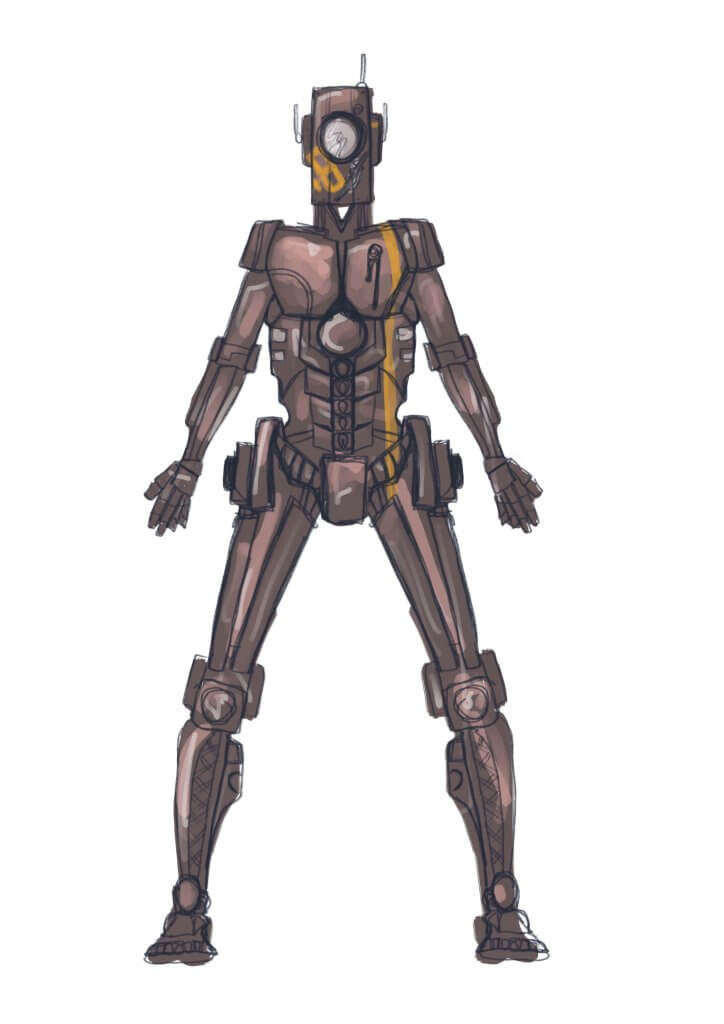
And here is a concept.
