For this assignment I was asked to produce artwork for an upcoming jazz festival, I looked for images for my moodboard, and researched what was expected from a jazz poster, they all seemed to include fun shapes and bright earthy colours a lot of oranges and yellows. Jazz has a very cool and laid back feel to it, I wanted to use that in the artwork, while still making it lively.
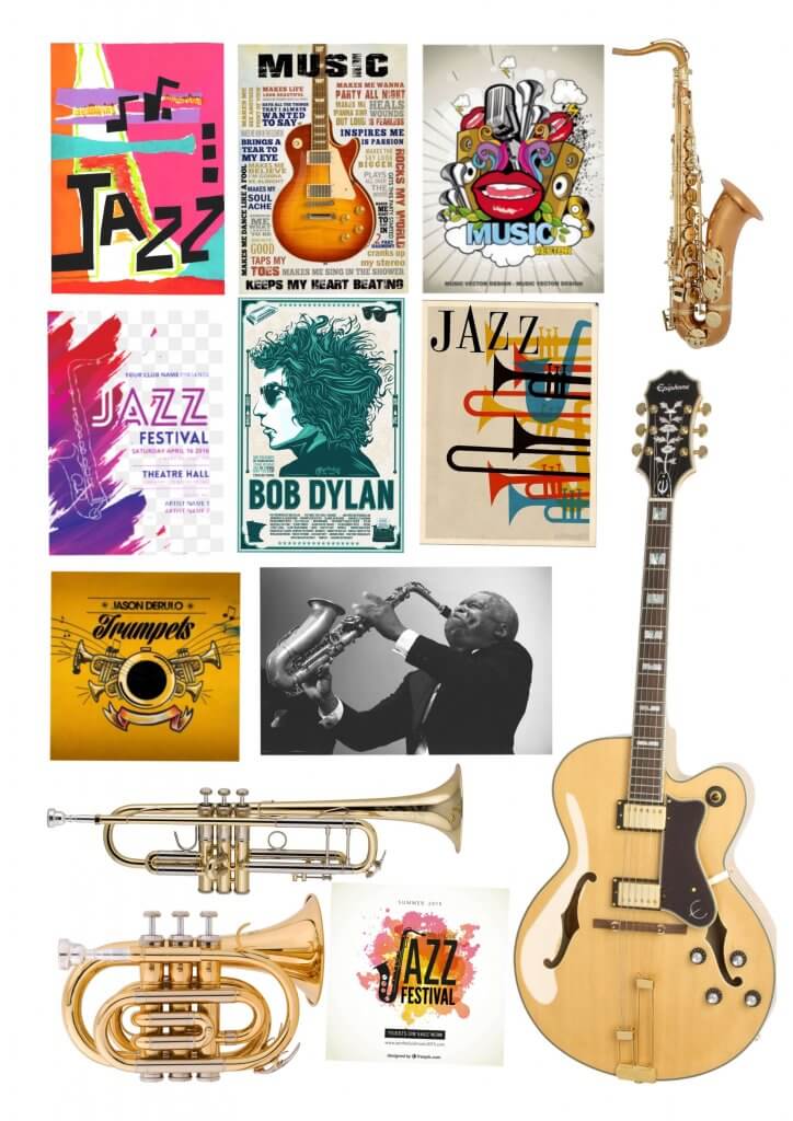
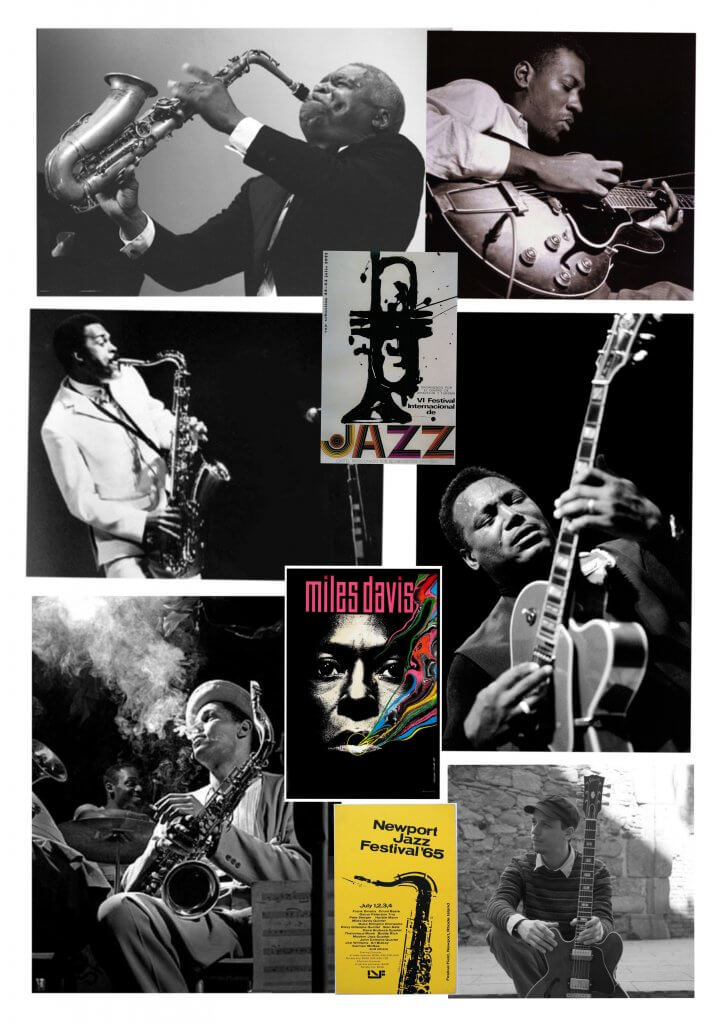
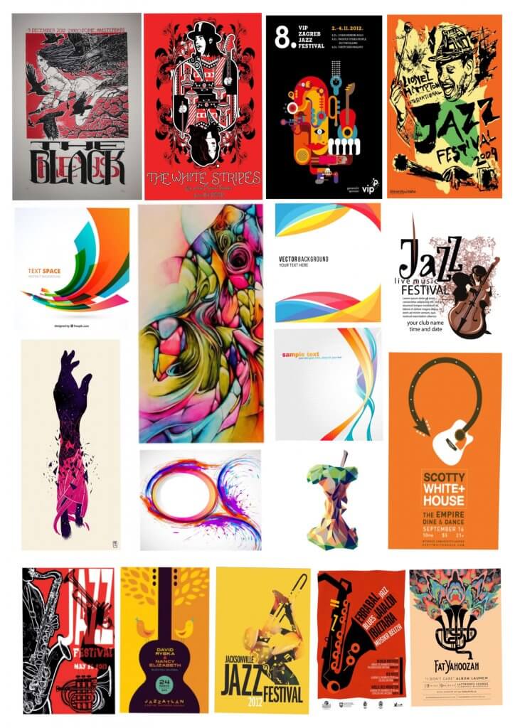
After absorbing the mood boards I had made I went to work creating my thumbnails, I tried to vary these and stick to the things I had seen and know work, I produced six very different ideas.
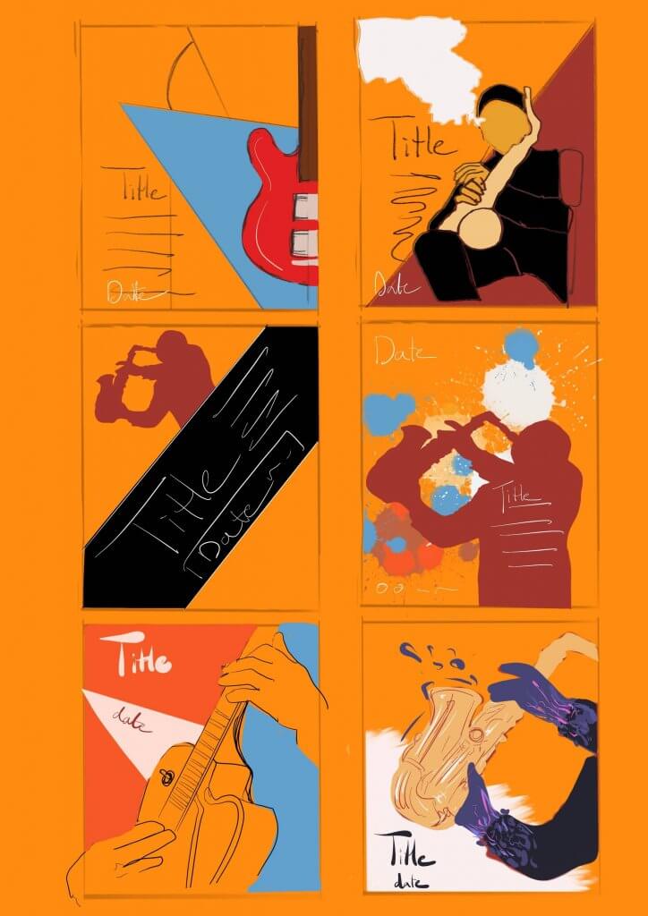
I took the two most successful ones and broke these down to their most basic forms as per the previous exercise, I do find this helps to re create the composition and iron out any conflicts, this is something I will definitely introduce into my work flow. The planning steps are important and when missed have always resulted in something I’m not happy with, spend ages fixing or worse still, left unfinished.

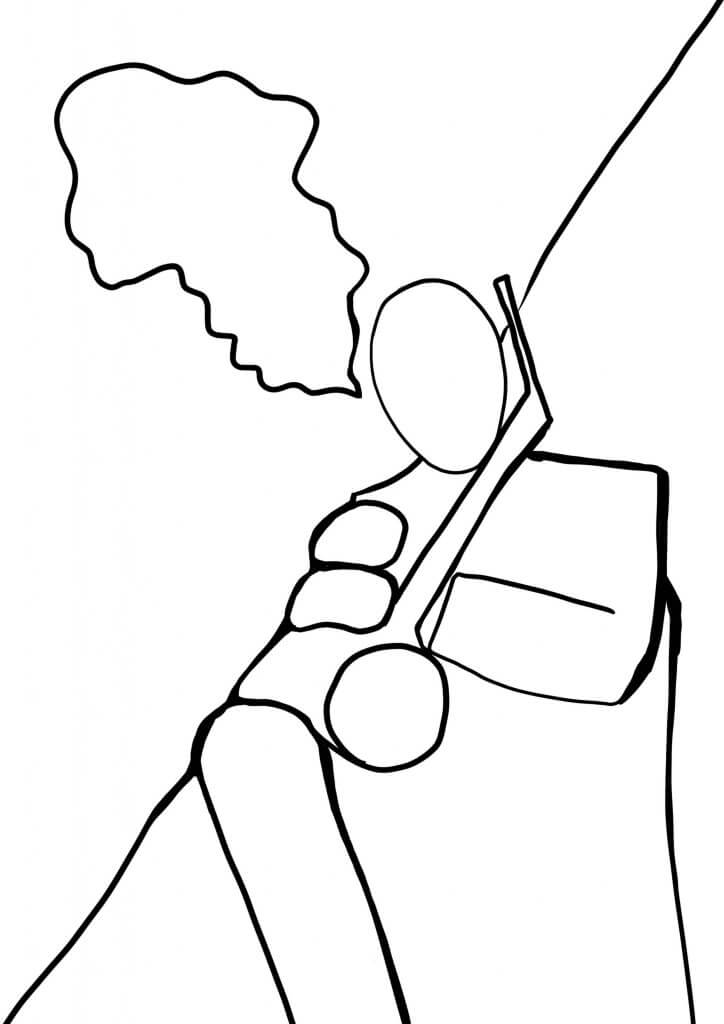
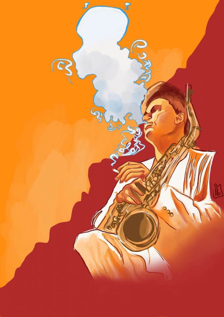
I decide on the seated musician this composition created a good diagonal, with a cloud of cigarette smoke breaking the line, I found this quite interesting and fit in with the blocks of colour feel of the other posters I had seen. The colours needed to be vibrant, I didn’t want to use flat colours as I’d seen on most of the others, It seemed a bit cliche’d and tired. I wanted to create a focal point for the text this would be on the middle to bottom left, where the cloud and diagonal line make a natural space for it to sit. Other information can still be displayed below such as event organisers and sponsors for example.
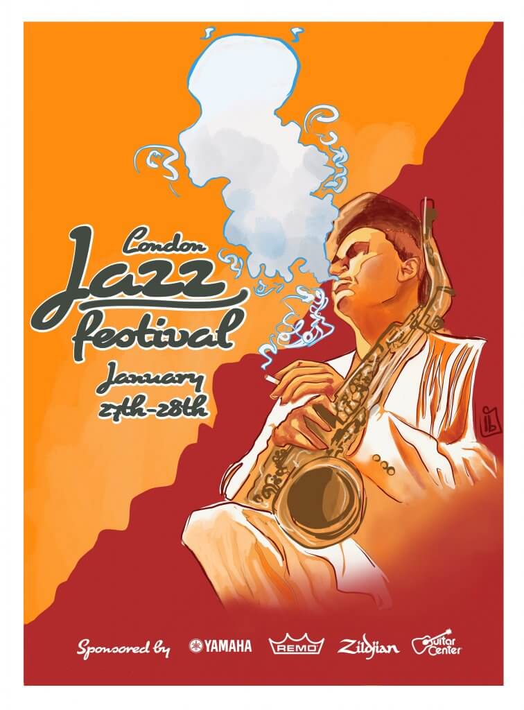
I added some text on this version to see how it might work, I’m not sure I’m entirely happy with the outcome, it has an art deco feel to it, maybe a more modern flatter approach would have been better after all, the colours are nice and vibrant and I do think it has a cool laidback feel to it, just not as exciting as I had hoped. Maybe sometimes these things are cliche’d for a reason, Im pleased I tried to do something else but if this was for a client I’m sure they’d want something more familiar.
