Exercise 1: Writing a brief

For the first exercise I was asked to write a brief for a piece of work that an illustrator I have a connection with, and to choose a piece I admired for its conceptual or narrative dimension.

One of my favourite illustrators is Jock, I have followed his career with great enthusiasm. He is a comic book and concept artist and his style stands alone with distinction in the comic book world. I am the proud owner of 4 limited edition signed and numbered prints that have increased in value although I’d never part with them, they are more precious to me than some extra figures in my bank account.

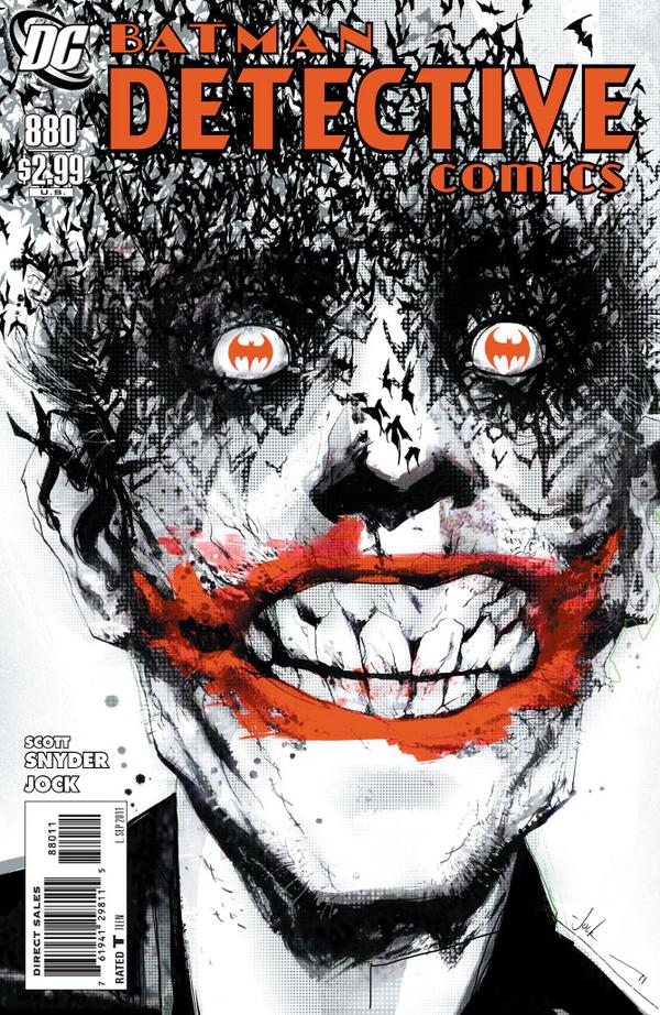
The artwork I chose to “brief” was the cover for Detective Comics #880, a batman story that features a now infamous cover.

– What are you being asked to do?

The brief is to produce original cover artwork for Detective Comics #880 a batman story that features the Joker. We want to show Batman indirectly, this should mainly focus on the joker.

– Why the client wants the Illustration- what they want it to achieve.

The artwork will be used to attract a sale of a comic book and possible later reprints as graphic novels, it has to be eye catching, exciting and dramatic with a “cool factor” to entice new readers.

– Who is the target audience?

The target audience are children to adult collectors from age 11 upwards, the content has to portray and uphold DC comics company values and shouldn’t contain excessive horror or violence.

– Where it will be produced and at what size?

The final artwork will be reproduced at 116.83cm x 26.0 cm which is a standard comic book size, however we encourage you to work larger as if the artwork is successful and gains a cult status we may want to use it for other promotional materials such as oversized editions and posters and other merchandise.

– Whether there are any restrictions as to colours you can use.

A limited palette is preferred and shouldn’t be too rich in colour, muted tones should be used in keeping with the feel of the book.

– Wether it will be used as a stand alone or with text, are there to be spaces left for titles, copy etc.

There will need to be space for titles, logos and barcodes etc, template will be provided.

– When they want to see the initial ideas, the visuals and the finished artwork.

Please submit examples of intended direction, preferably no more than 3 initial ideas, these have to be descriptive but not necessarily detailed. Once approved a deadline will be set.
batman detective comicds #880
Jock’s cover for Batman Detective Comics #880

Brief 1: Good Food Magazine

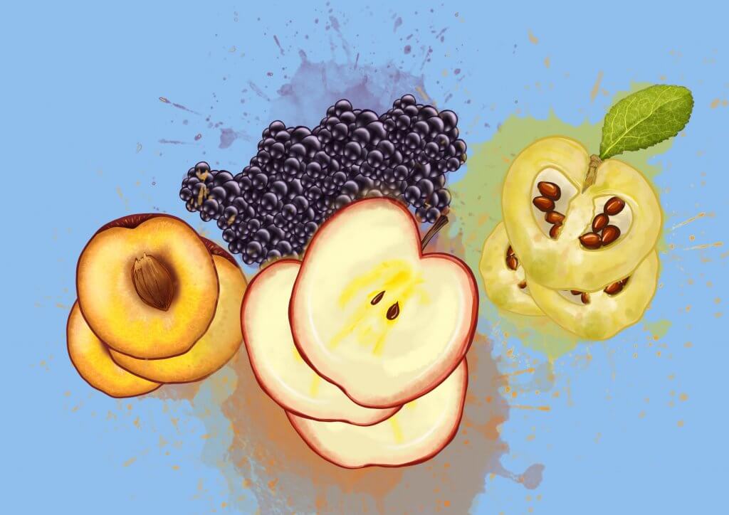
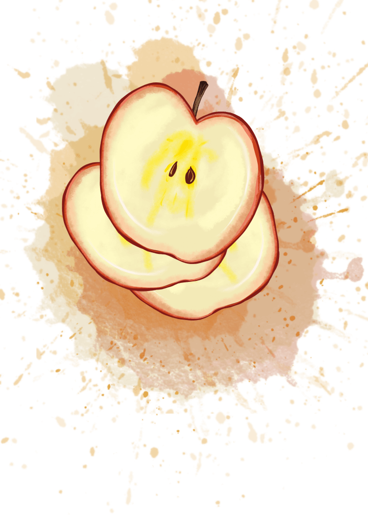
For this brief I was asked to create an image of seasonal fruits for Good Food magazine.

The problem:

  • To make a selection of appropriate fruits
  • To make the fruit seem appetising
  • to create an image which will work against text in that particular publication

I researched into seasonal fruits and gathered some information, from that list I started sketching out some ideas, I initially wanted to do some straight photographic style images, I have seen these featured in cafes and restaurants around london and they always looked quite appetising, once I started working on a drawing it really seemed quite a stagnant and passive concept, so I stopped working towards this direction.
I started to think about what makes fruit appealing, it’s not the organic shape, the lumps and rough bits, these would need to be present in the Illustration to depict the subject faithfully and accurately but wouldn’t make it appetising.
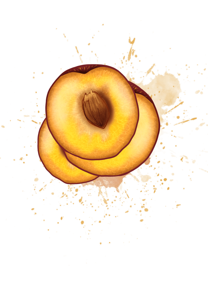
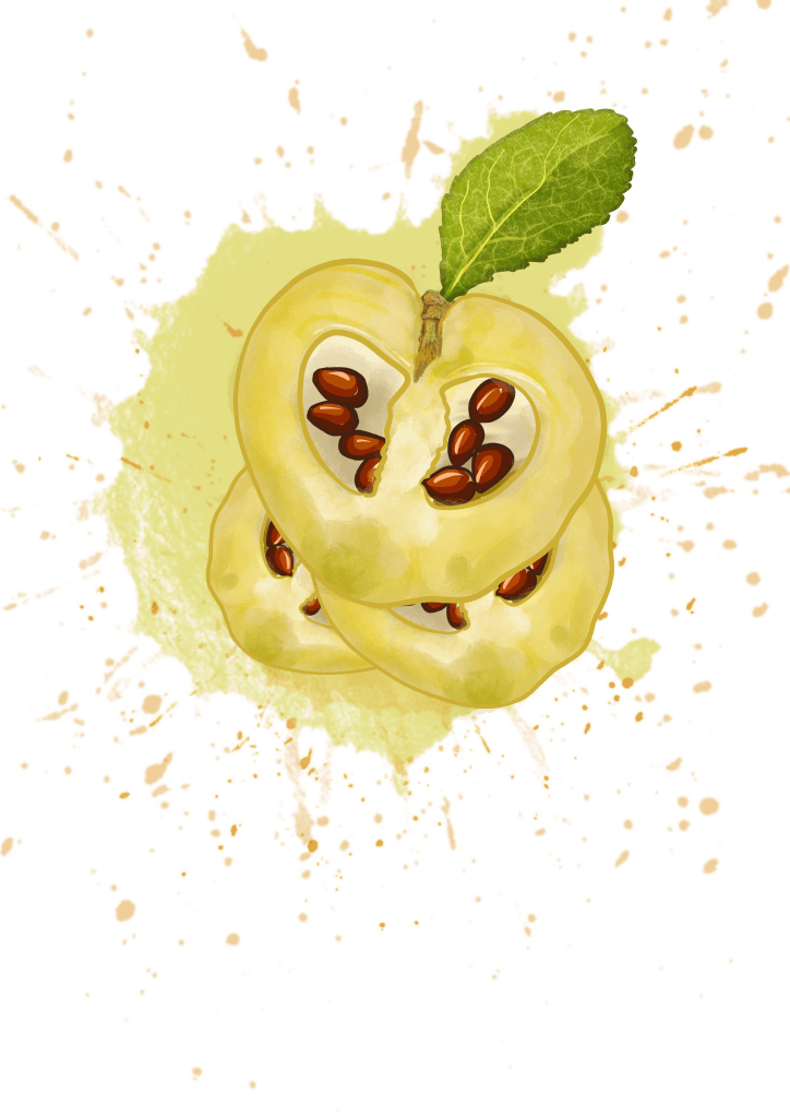
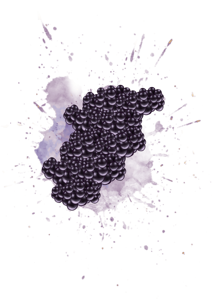
I came to the conclusion that Fruit is preferred when its juicy and ripe, colourful and interesting to look at, I started to sketch fruits cut in half and included some splashes, I kept the shapes simple the detail minimal but with texture, this to my mind seemed to fit the brief.


Brief 2: Radio Times Article

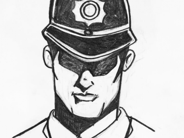
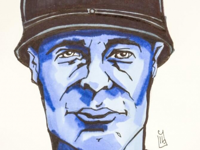
For this brief I was asked to create an image for The Radio Times for a TV programme about racial discrimination in the police force.

The problem:

  • To come up with an idea that suggests what discrimination is
  • To ensure sensitive depiction of people of diverse ethnic origin
  • to create an image that entices people to watch the TV programme

This was a real challenge, Racial discrimination comes in all forms and guises, and was essential I stay fair and impartial in the presentation of the artwork.

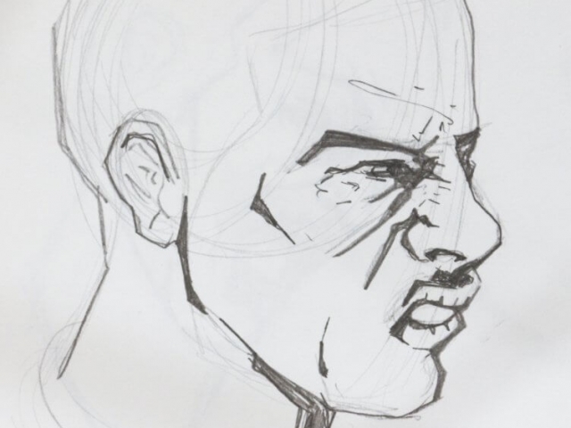
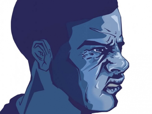
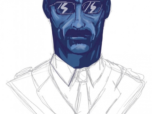
I originally planned to make a grid of police officers all looking outwards with an officer in the middle being looked at from above below and from the sides.

This seemed like a good enough concept, but it was flawed as it meant showing different ethnic groups even though I intended on showing all the characters in blue tones, I didnt want to portray a group as a victim and I didnt want to imply the depicted groups were all racist, I then thought what if I didn’t show their faces, I then came up with the idea of using skulls.
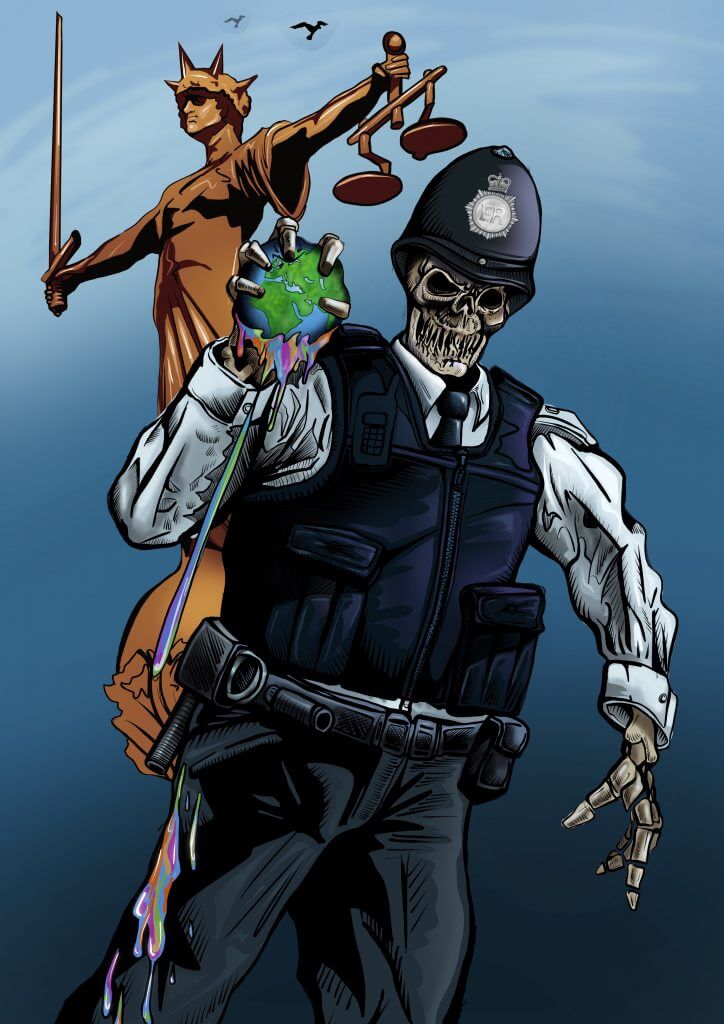
Using Skulls would remove any reference to ethnicity and make a strong statement, we are all the same underneath.
The skull idea would bring a very sinister and dark tone to the image, which I eventually offset with bright colours.

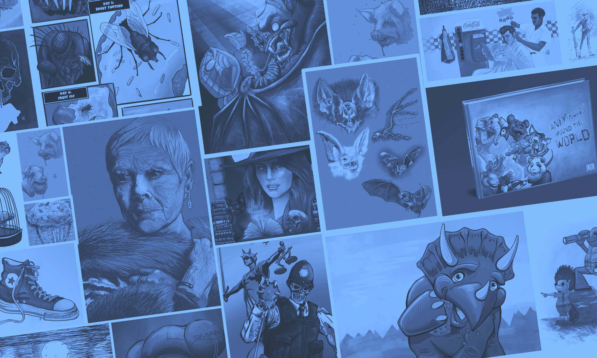
I then had the idea of putting the skulls not in a grid but depict a skeleton police officer, squeezing the colour from the world, the symbol of lady justice with her scales in the background looking away, the whole act of discrimination being a hate crime carried out by people paid to enforce the law.
I felt  was on the right tracks, I’d solved the problem of keeping it equitable so as not to offend minority groups and to come up with a shocking and visually interesting concept to attract viewers.