This exercise asked me to consider the different ways I could produce a folded leaflet, it called for me to be creative in its delivery and to physically try out some approaches.
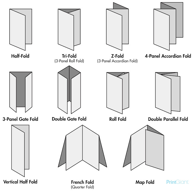
To get a good understand of the different available and widely used folds I googled some different fold types, some are very simple others more complicated. I was able to rule a few out by doing this.
I have four sections of text with approx 120 words in each section. I used a lorum ipsum generator to visualise roughly what 120 words would look like.
Lorem ipsum dolor sit amet, consectetur adipiscing elit. Nam luctus nisl nec tortor aliquam, rutrum finibus elit consequat. In condimentum, diam quis porttitor ullamcorper, est eros pretium tellus, non facilisis elit libero non massa. Etiam consectetur semper sem, in fermentum sapien lacinia vel. Fusce sem lorem, pretium accumsan sagittis et, fermentum vel purus. Suspendisse nulla tortor, ornare id elit eu, tristique bibendum leo. Cras quis condimentum libero. Praesent quis velit at sapien volutpat mollis sit amet quis lorem. Mauris feugiat augue at magna tempus, at dignissim sem mattis.
Maecenas elementum massa eget viverra eleifend. Morbi eget augue facilisis lacus consequat luctus. Fusce tristique sit amet urna ac varius. Curabitur hendrerit justo a lorem ultricies elementum. Donec pulvinar enim efficitur lacus.
Thats a fair amount of type for a leaflet, as there will be four of those. sections. The way that information is structured and displayed is going to be a key factor if we want the leaflet to be successful. With that in mind I fetched some paper to experiment with how the user might open a word heavy leaflet.
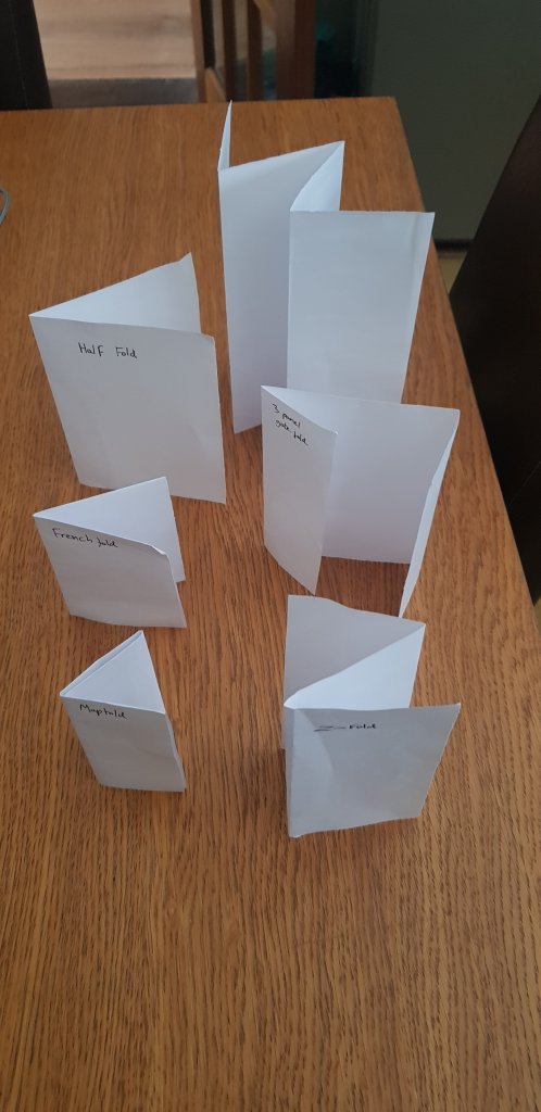
The obvious choices were the four section layouts, this would accommodate the four blocks of text nicely. this would be the least creative solution though, I quite liked the idea of the user being engaged with the unfolding, maybe delivering a part of the message in small suspenseful chunks, urging the user on to unfold the next section. Im also assuming here that printing costs are not an issue, double side printing, die cuts etc.
I started to wonder if there was a creative way that I could ensure the recipient of the leaflet wouldn’t just take it and throw it away, I thought about maybe a map to the communal garden, a free giveaway or an activity might be a good way to ensure the leaflet is looked at and not thrown away immediately. I then thought the leaflet could be folded as an origami flower, this could be kept or re distributed to someone else to fold, spreading the message. Origami can be quite complicated, even the simple flowers are hard to fold, I would need to find something that was simple enough to unfold/refold without affecting creases affecting legibility.
Most origami seems to be on square paper, the simplest tutorial wasn’t the nicest looking flower but it did make for a more interesting than square or rectangular shape, it was easy to fold and unfold and refold as below.
I had several abandoned attempts that I thought was just impractical and too complicated, I wanted the end result to be easy t unfold and to ideally be refoldable to pass on to someone else.
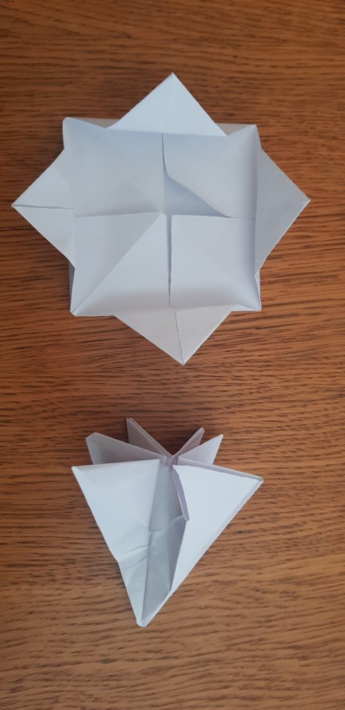
I added in some details, to see how it might work directly to the paper prototype. This helped to show what sides of the folded paper would be visible and the boundaries I was working with.
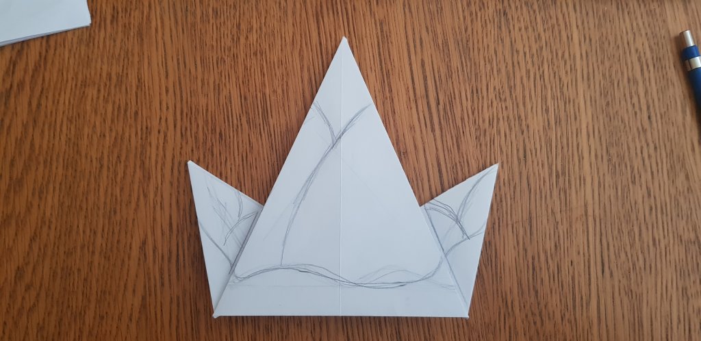
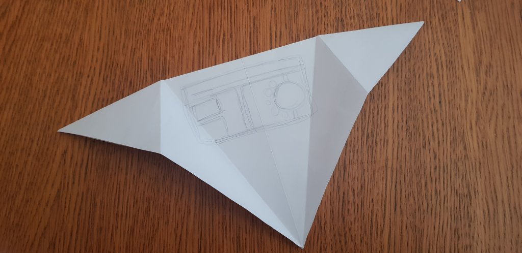
I don’t think the task asked for me to produce a finished product but I added in some colour and some loose messages to get a feel for it.
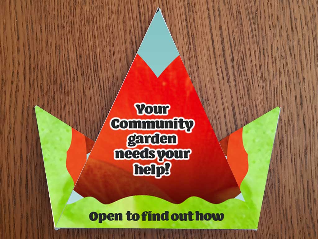
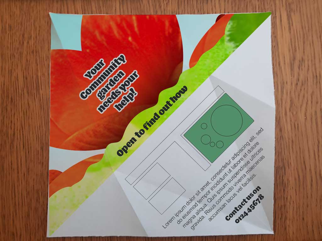
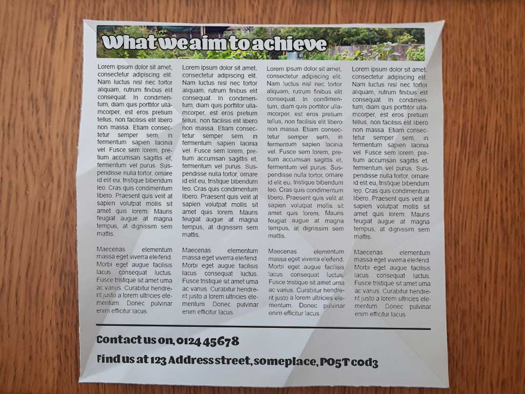
I really saw the benefit of this exercise, to feel how the end product would work in hand was a big help, the actual aesthetics and design of the leaflet isn’t quite what I’d choose, but I didn’t want to invest too much time in that aspect of the task. There is many ways you could complete this task but having that prototype in your hand to help the decision process was really helpful.
