I have tried to break down the characteristics of his line and wash pieces, they are all very economic with their lines, opting for simplicity over complexity, this is going to be a hard habit to break so I decided to get a some scraps of paper and mark make for a while before attempting anything.
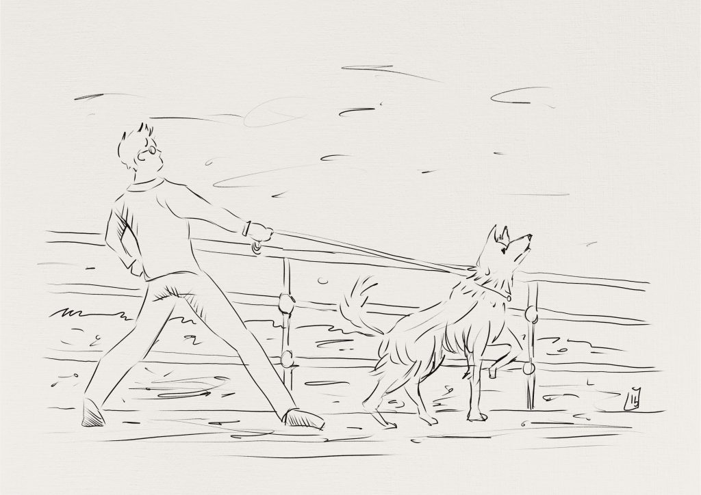
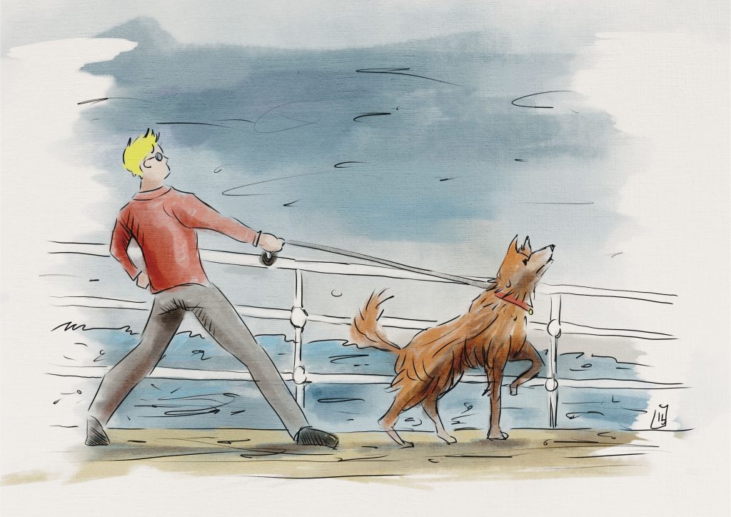
I then turned to my computer to attempt an Edward Ardizzone inspired piece, I decided to depict his character Little Tim all grown up and walking a similar looking dog along a pier, I aimed to keep it as simple and loose as possible, not sure if I succeeded in selling the solidity of the character to the standard he did in his watercolour images, but I’m certainly more aware of the impact a realistically lighted figure has on an image, even one that is not necessarily a realistic depiction but a more stylized one.
I really like the way he lights his subjects so simply but effectively, its been a good observation and will surely influence my future efforts.
I used line sparingly, just enough to suggest shape and form the way Edward Ardizzone did. I used a similar line weight throughout.

Once the colour was applied it started to break up the image, and gave it some atmosphere, the shadows helped to show the movement between Tim and the Dog. The sea and sky I think worked well and added a narrative not seen in the black and white line work, its clearly a windy unpleasant day, with rough seas and dull sky.
I was quite happy with the mood that was created, and I felt it was a successful exercise in visual storytelling.
Below is the final coloured version.

This was a worthwhile exercise for me, it took quite a lot of discipline to stick to the characteristics I had observed from Edward Ardizzone’s coloured work.
I have noticed it has made me more analytical of the work of others and has made me think about how I can style my work to be a bit more defined and distinct.
