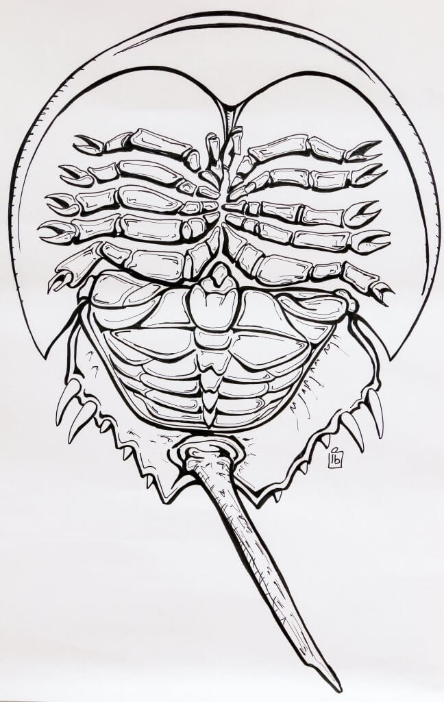
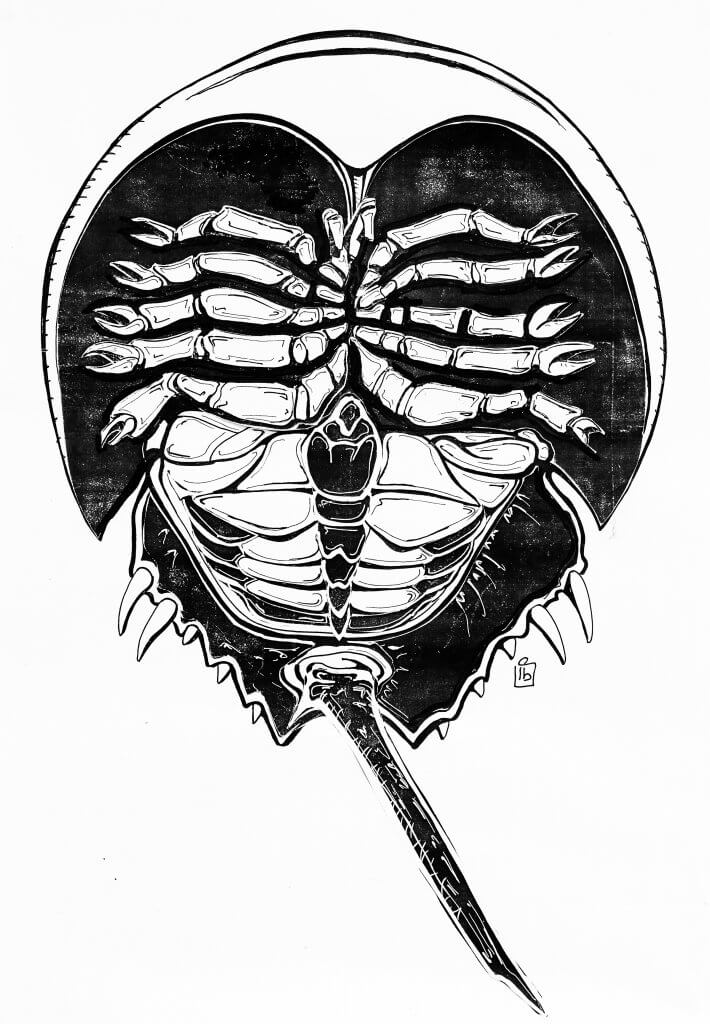
For this exercise I was asked to pick a word and draw an object associated with it, I brainstormed the word Sea, I decided to draw a Horse shoe crab, I chose this as it’s quite a strange sea creature and one that would afford some good interesting shape and detail.
I then photocopied the image several times, I then made further copies with the inverted option. After I made the copies I cut out the key shapes, and arranged black over white and vice versa.
It really made me think about what tones to put next to each other to best describe the shape, as a fan of comic book art I’ve often marvelled at the choices made by the artist who ink the panels, they always put blocks of black in just the right places to bring depth and form to the pencils.
I knew i wanted to draw attention to the legs and have them appear from the hard shell of this ancient crab i cut out the dark shape and laid it on, I then did the same to the legs of the white photocopied image.
I found also that sometimes to draw attention or emphasise detail it was necessary to make surrounding pieces darker, a good example of this is the bottom section of the crab where i added some blacks to break up the shapes.

This was a lot of work cutting out and making choices to serve the image, but I have to say well worth the effort and was a great exercise to learn the benefits of contrast in an image and how it can take a simple linear drawing into something much more descriptive.

