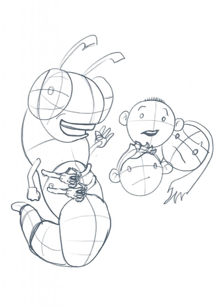
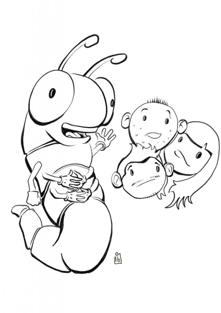
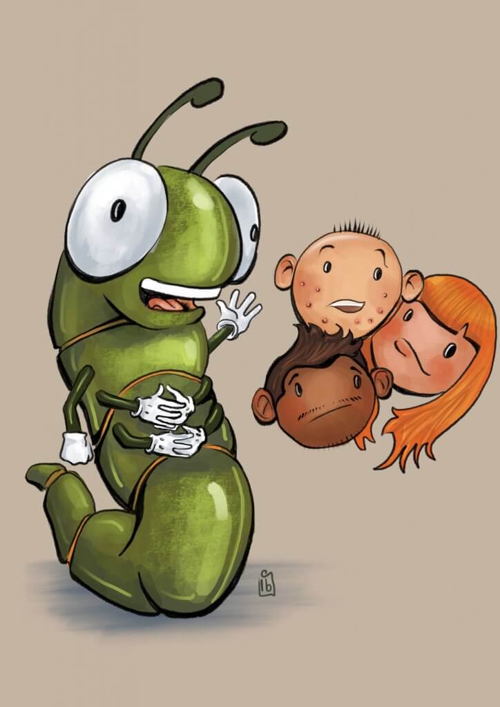
For this Exercise, I was asked to produce a strip of up to five frames explaining some of the aspects of puberty to youngsters. My Idea was to use a caterpillar as a metaphor for change, he would narrate through some of the points I wanted to cover off.
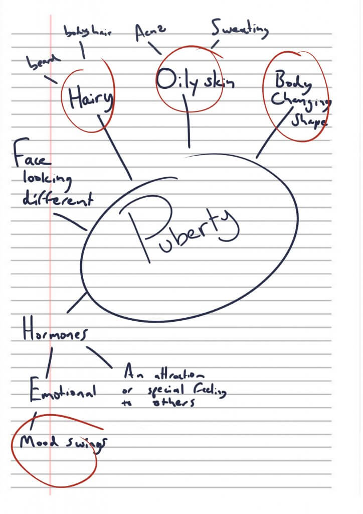
I started off with a spider diagram, going over some of the changes in puberty I didn’t want to include anything too heavy as I only had five frames to cover things off. I settled on the following points;
- Mood Swings
- Hair Growth
- Oily Skin
- Sweating
- Spots
- Body Shape
It was quite a challenge to get all the information on the sheet, with such a small space I had to be brief and to the point. I tried to make the drawings light-hearted as it is a delicate subject matter, going for a simple cartoon style.
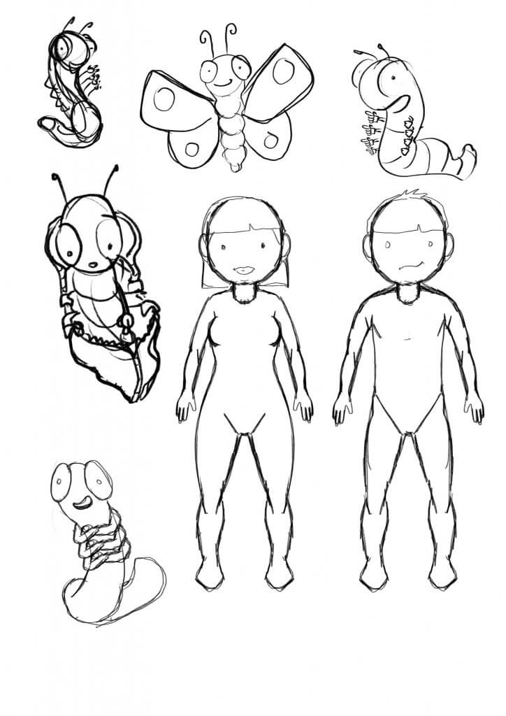
I practised a few simple shapes for the characters, Keeping them simple but expressive. I also explored some different ideas for Layout, I imagined this to be a folded leaflet that opens out, a cover on the front and further info links and telephone details etc on the back.
I also explored some possible layout ideas for the panels.
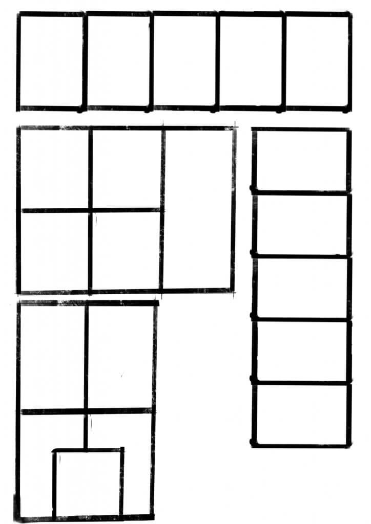
This was the first pass, I didn’t feel it had much of a flow,
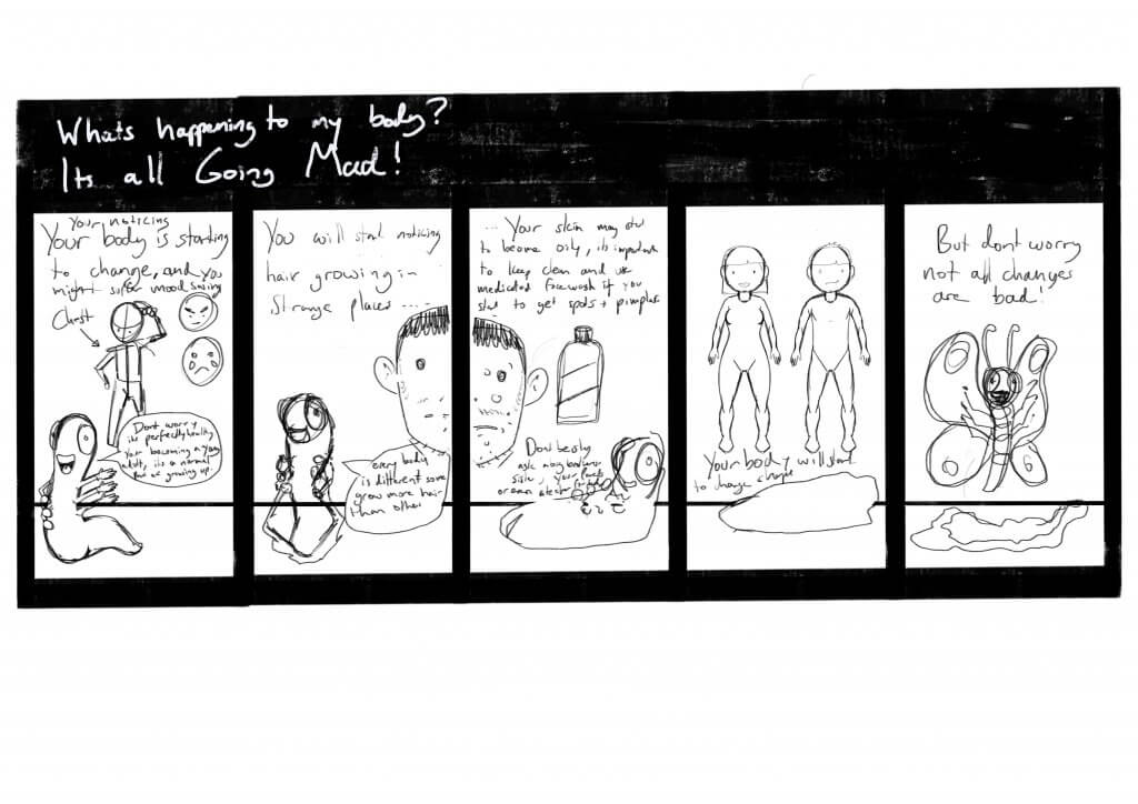
I decided Id divide the five panels up with a large opening panel followed by three smaller panels in a row, and finishing on a large full-width panel.
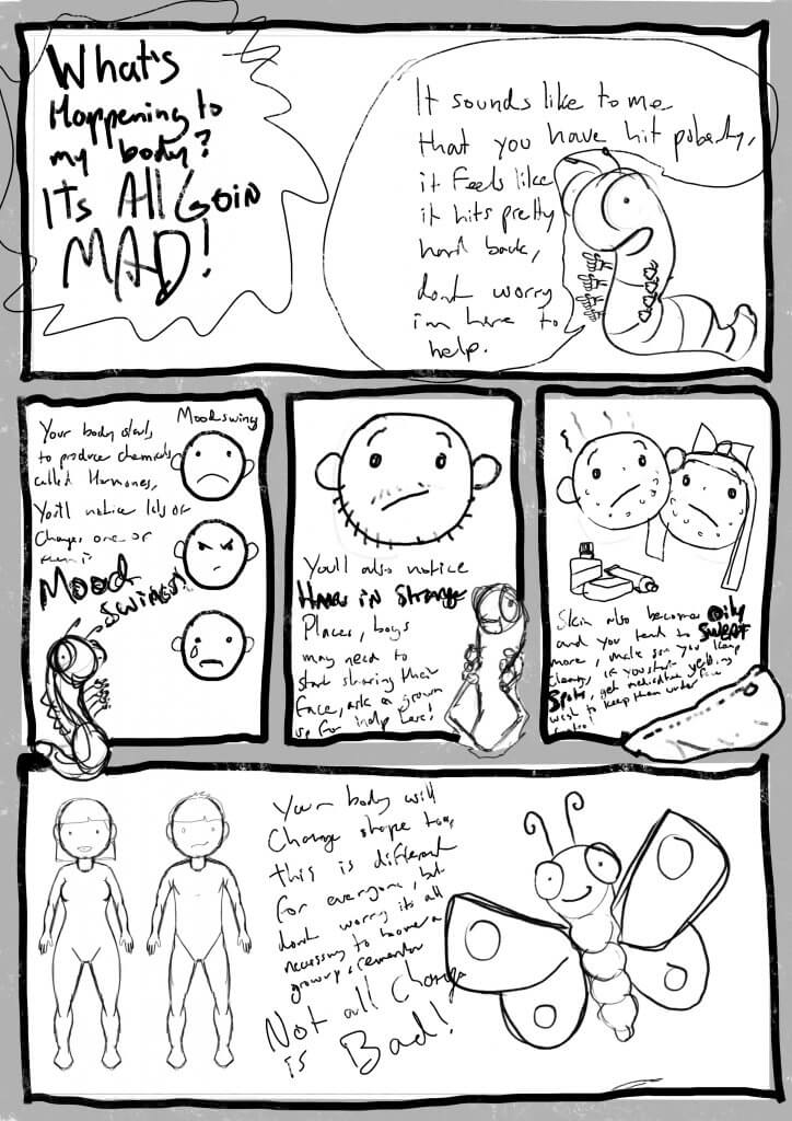
I decided to trim the text down a little as it seemed to be a lot to fit in.
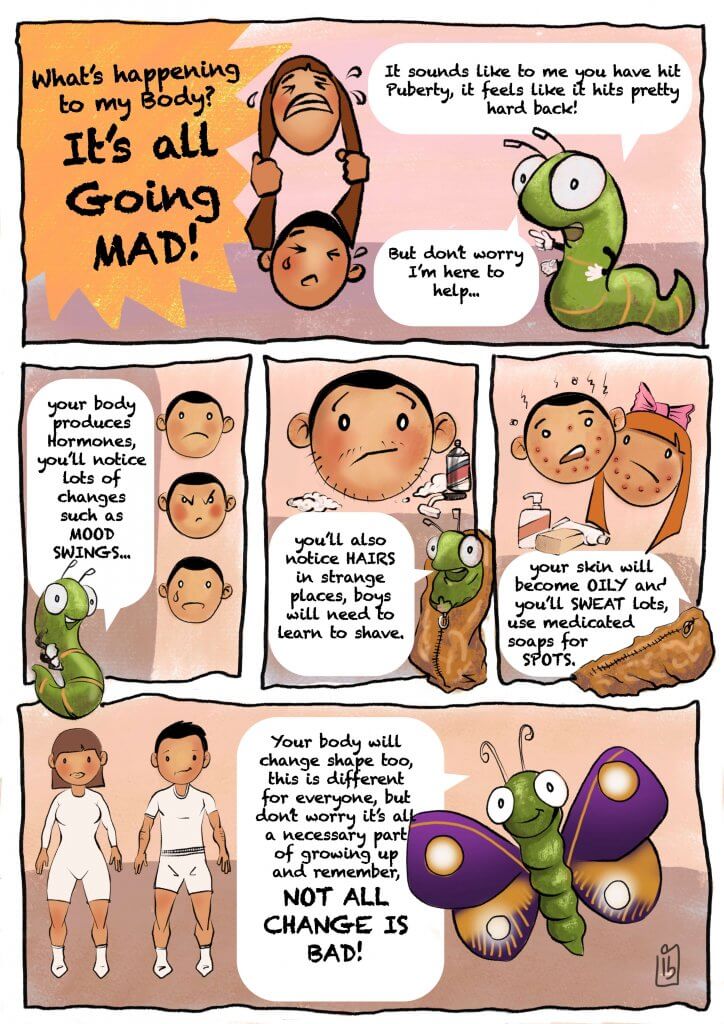
I’m a little undecided about how successful this exercise was, I wonder if I had made the tone a little too young for the content, I know on one hand young teens will likely still watch animated tv shows or even read comic strips, maybe if there was more humour in the artwork it may have helped set a context that a cartoon suits. On the other hand, it is a serious somewhat potentially embarrassing subject to convey at the best of times but maybe a 13 + year old would appreciate something a bit more formal that addresses them with an adult voice.
