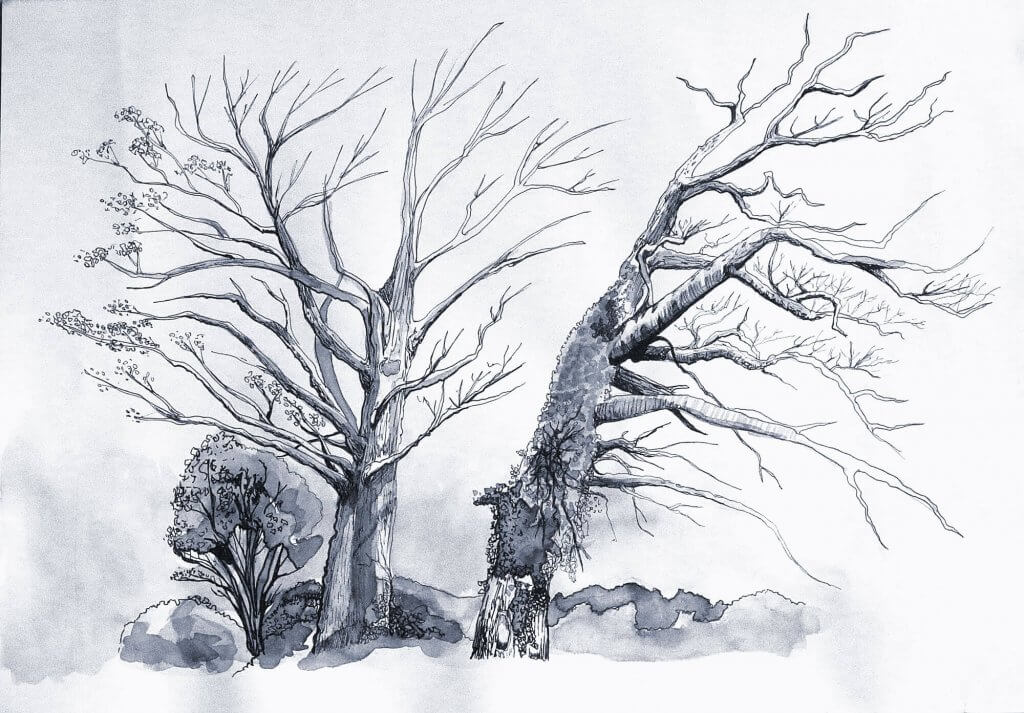
While my study hear was of indeed two trees, I really liked the way both trees worked in tandem and made one larger shape, the trees never seemed to encroach others space even growing and leaning in or away so they never collide. Another thing I liked was the contrasting trunks, one was covered in ivy and foliage, the other smoother with a few remaining leaves.

I sketched the tree, taking care to observe the relationship each tree has with each other. I added blocks of tone lightly with my pencil, I planned to ink over all these lines, so I pressed as lightly as possible so I could remove all graphite. once my sketch was in place, I had my tonal values all decided, I photographed the area just in case I needed some more reference when it came to inking, I then moved on to the groundwork for the next exercise before leaving.
I prepare the paper for inking, using a putty rubber I gently dabbed the harder pencil marks away so the ink isn’t hindered when applied to the paper. I diluted some Indian ink and with a brush I laid out blocks of tone, I had a jar of clean water and added more water to create lighter tones, I layered up light to dark creating a leafy texture for the foliage which had attached itself to the trunk. Once the paper was dry, I used a 01 waterproof fine-liner to start adding lines building them from thick to thin. I also added in some tree bark textures, creating broken lines though the length of the trunk, and circular movements around the branches to describe the rounded shapes. I made a second pass with an 03 marker to tidy and stray lines and block in any very dark areas.
I was happy with the outcome, the diluted ink gave a good amount of texture, the whole image has a very cold and winter feel to it which seemed to suit the sparsely covered tree.
