I was asked to draw 2 self portraits, before doing that I was also asked to make some 5 minute sketches, this not only served as a good warm up exercise but also gave me oppurtunity to observe my own face in detail.
I worked in a3 size, and used my thick graphite pencil . This has proven quite useful in creating fast and loose drawings that require minimal detail.
5 minute sketch #1
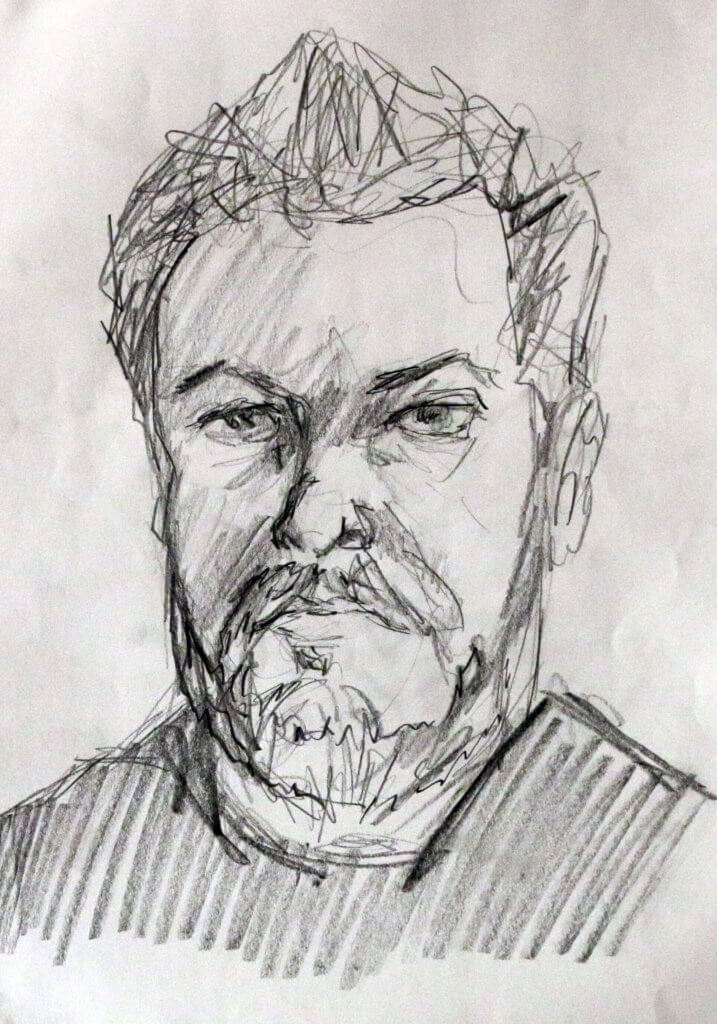
My initial sketch is actually my favourite, I think it might have turned out different because I was a little more cautious, and thoughtful even though 5 minutes didn’t seem very long, I seemed to have made more useful choices in describing my face.
5 minute sketch #2
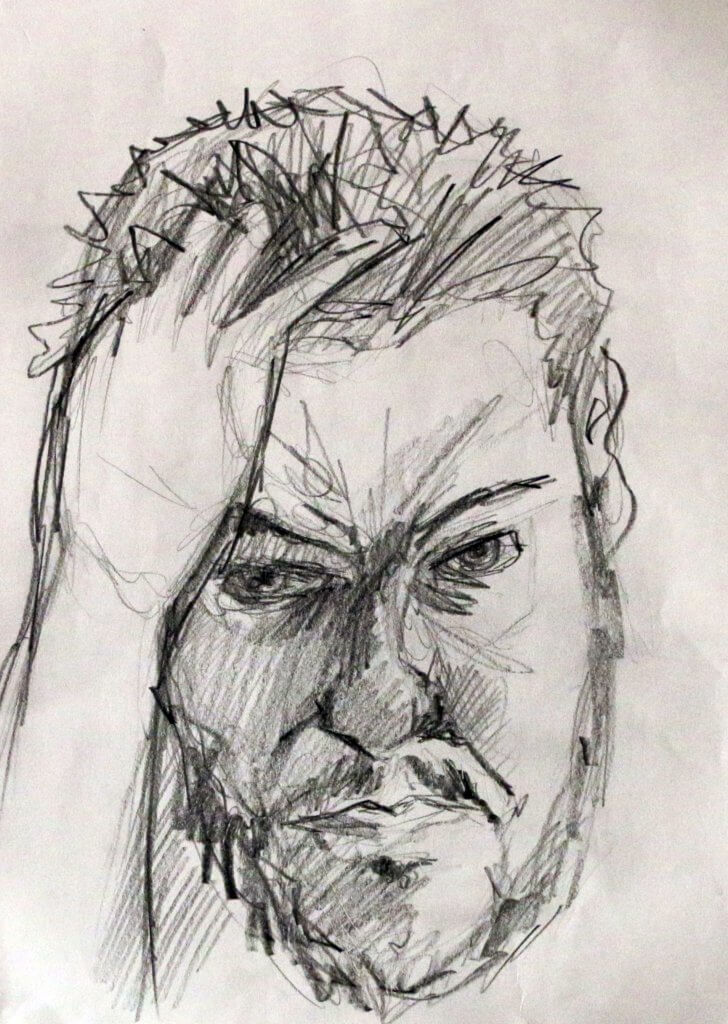
The pose for this one was better, the proportions of the hand was a little off at first, and look still to be on the small side in the final drawing. the emphasis on this drawing was more tonal than the previous, the abscence of light on the right side. of my face does help to describe the shape but could have benefited from some refinement, after a’ll this was a 5 minute sketch so withy the time allocated I think it captured some useful information, on not only my face but how I would approach a more complete image with less strict time constraints.
5 minute sketch #3
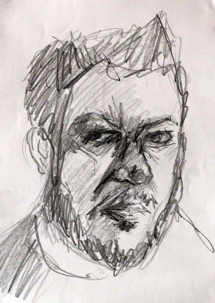
The heaviest of the three sketches, this one remains the most unfinished, I didn’t have enough time to describe all the tonal range I was seeing in my own reflection, I went in quite fast and bold, another ten minutes and maybe I would have created enough dynamic range to describe the form of the head and added some more detail.
Portrait 1
The first portrait, in my opinion suffers from 2 things, 1) it is very heavy and 2) it is quite elongated. It’s not the end of the world but it feels very heavy, I ended up forsaken a lot of form by going in too dark, the softer pencils also muddied up the picture somewhat, my next portrait I want to aim to be more subtle, using harder pencils and building them up. this drawing mainly used a B pencil, the next I think i will try one of the H types and layer up to get harder edges and mark, building on each one to get darker and darker. the elongated pictire was all down to the angle I drew this at, i used a board and A3 paper but the paper was flairly flat to the table, my view point across the angled paper was skewed, the large sheet of paper exaggerating the angle, I have tried to repair this in the photos below.
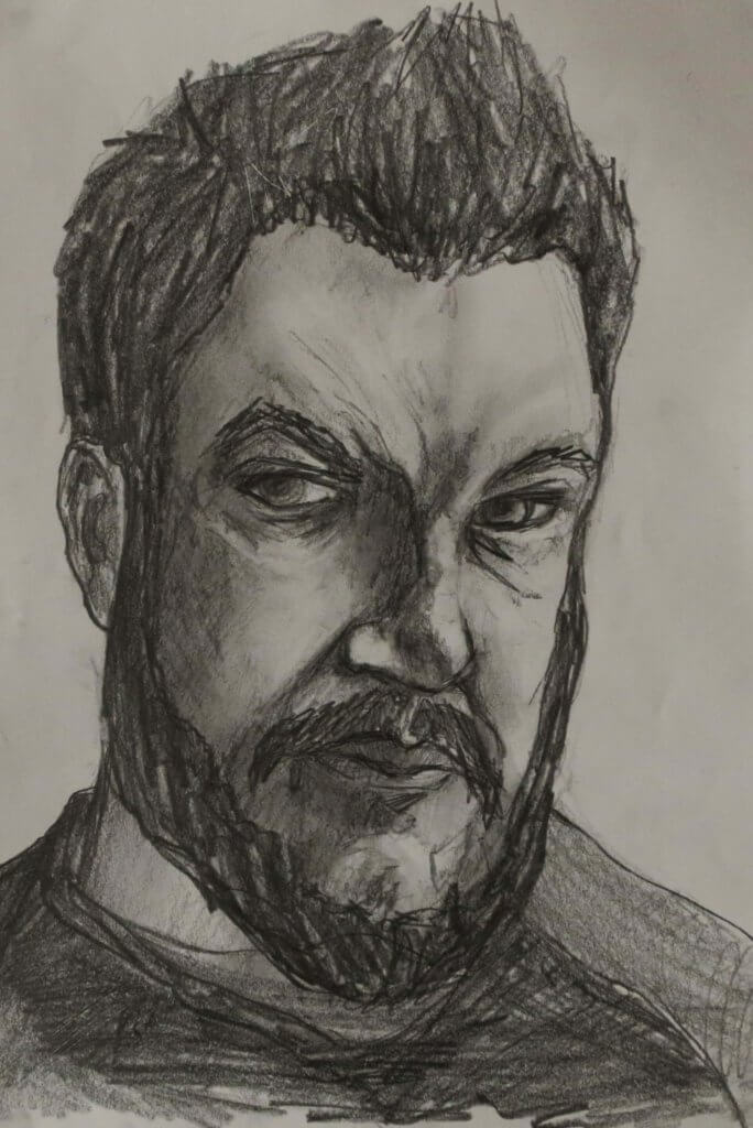
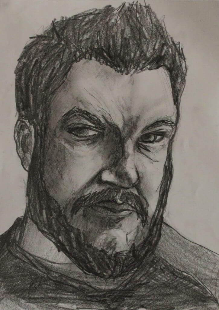
Portrait 1 (second attempt)
This portrait felt more succesful. The portrait is similar to the previous, but harder pencils, a slower approach and a suitable angle for the drawing board made for a slower and more calculated approach, I used small marks for texture and tried to follow the contours i observed in the mirror around the shapes in the drawing. I felt there was a lot more tonal range here to be used and offered more detail.
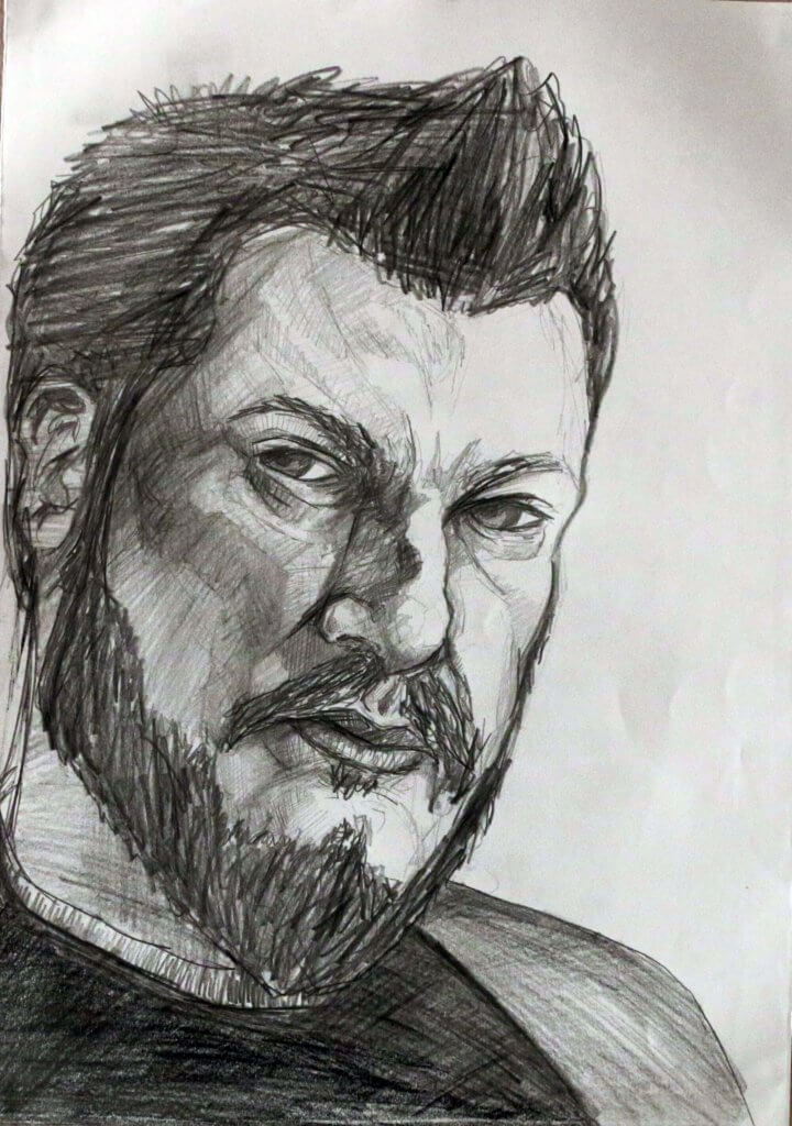
Portrait 2
Using some toothed green pastel paper with conte sticks, I quickly marked out my face, a mark indicating the harline, top and sides, some soft marks for the eyeline, then nose and mouth position, I mark out the hard fixed structures around the eye the cheek and brow and then start to observe and document the shape of my features. my conte sticks are brown, orange, white and black. surprisingly the red in the brown conte stick when blended with the white makes some good skin tones on the Green paper, that was not my intention, but I didn’t mind it all the same.
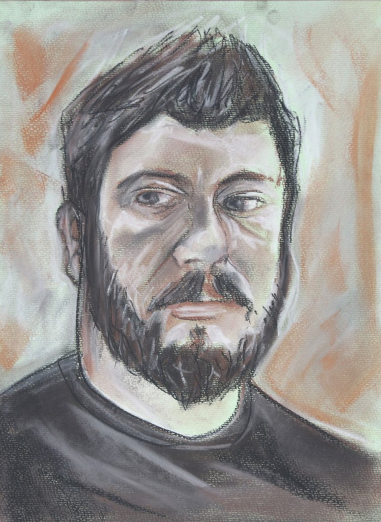
Over all I was really happy with the session, in fact I really enjoyed it, although my angry expression would make you believe the contrary. I learnt an important lesson, and one that needs to be applied before I even make a mark, make sure you are in the best position to draw, particularly on a large surface.
