This exercise asked for me to design two posters for an upcoming event, this could be a jumble sale, a local gig, concert or play, an exhibition or sporting fixture. Due to coronavirus there is not a lot happening at the moment, I googled local events and it took me to a listing for the London wildlife trust, they are asking for donations to protect rare insects, they have used a banner saying “Protect chalk grassland for rare species before it’s too late” this seemed like a good direction for the project albeit outside the suggested parameters as it offered a lot of information on the subject.
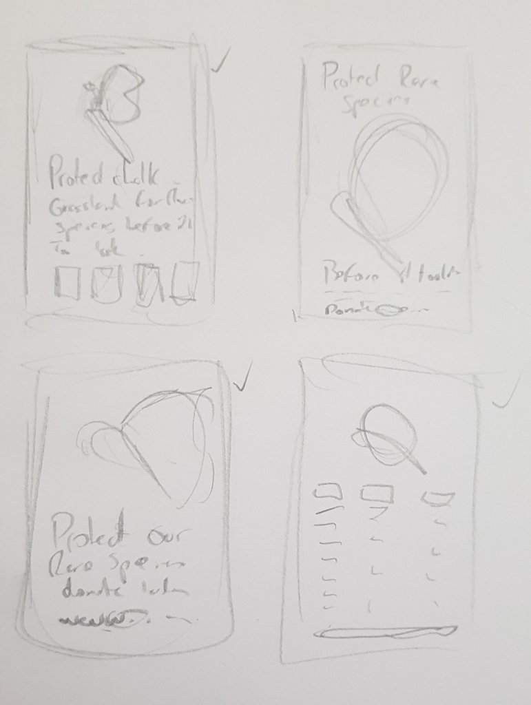
I did a few quick thumbnails to test how I might lay this out.


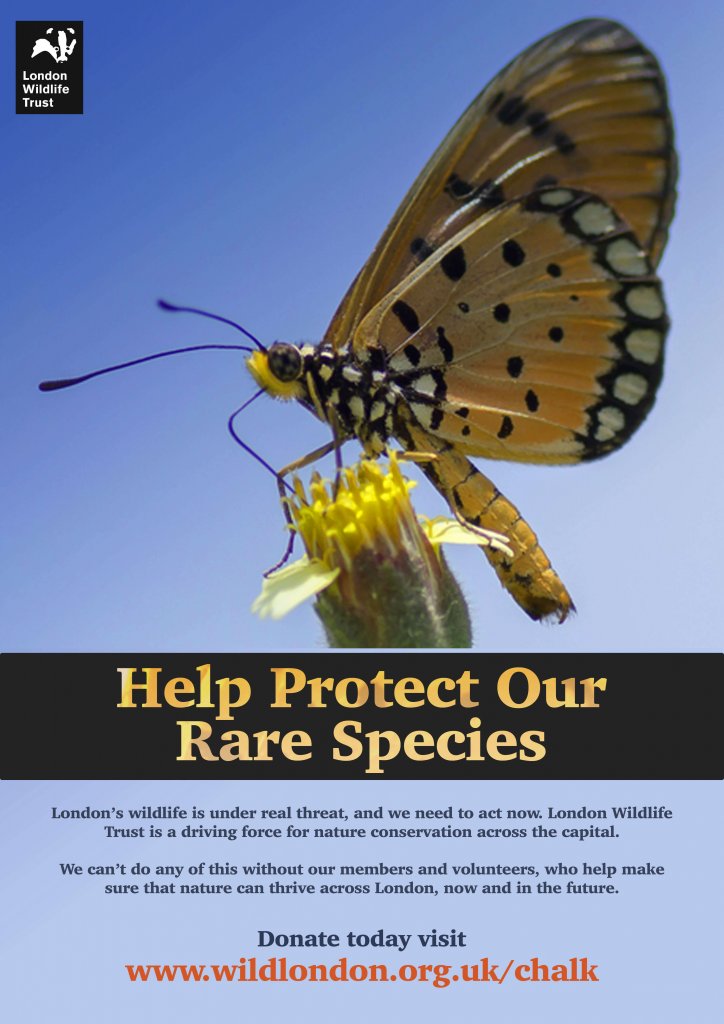
The above image is the minimal version, broken down simply I have;
- An eye catching image
- A contrasting short title
- A small amount of text to explain the title
- The URL for the site for donations and more info
- the organisations logo

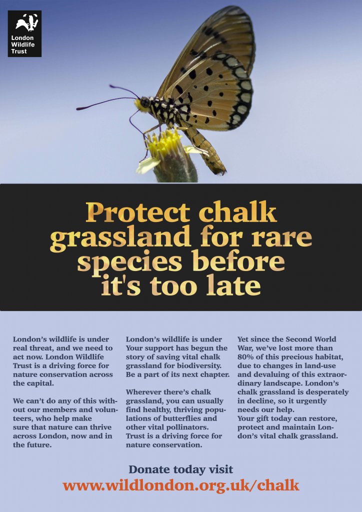
In this version I have;
- The same image but smaller to accommodate the type
- A longer title
- 3 areas of text to qualify the titles message
- The URL for the site for donations and more info
- the organisations logo
Structurally both images are similar, I feel an image is necessary as is a title, both offer context to each other and draw the viewers eye. once the viewer is engaged they will be happy reading a small amount which leads them to an action , in this case visiting the website to either learn more or male a donation. The logo as long as it is memorable acts as a signpost so the viewer knows they are at the correct place.
I asked my partner which one she liked best, she actually liked the second version with all the extra information, I asked why and she said that one has more to learn from as there is more text. I think context is definitely a variable here. as a poster then the first one is best the second is more of a flyer or leaflet, this may not have been obvious when I presented the two options.
