For this exercise I was asked to design a book cover, spine and back page for a book I was familiar with, I was asked to create 2 versions, one using photography or illustration and the other using only type (no imagery) I picked a book I was familiar with and had recently recommended to a friend.
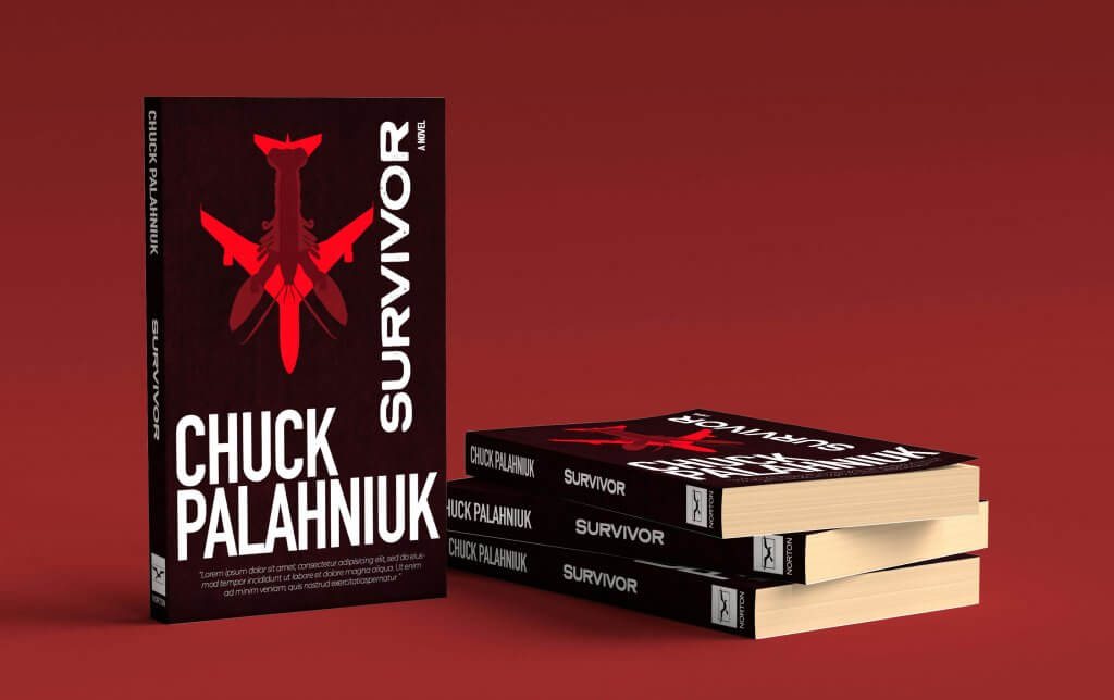
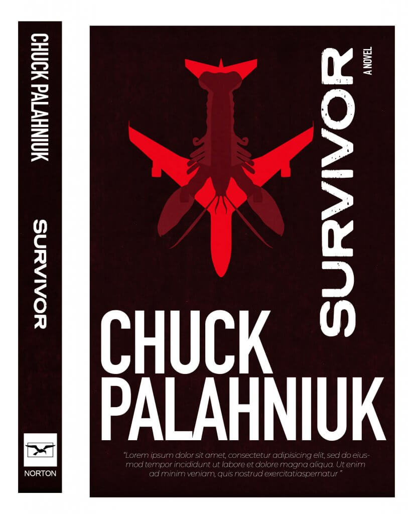
I decided to create an illustration rather than photography,As I recalled the book a scene was very prominent in my head, it involved lobsters, the story center’s around a man who as the story unfolds decides to crash a 747, killing himself, these things both had strong imagery and the shape of a lobsters tail and body reminded me of an aeroplanes tail and fuselage, I drew both out in procreate, using the mirror functionality for consistency.
I added a fine colour halftone filter over the image, I wanted a distorted look to the image and title, giving it a “pulp” novel feel. I took the Stephen King Approach and made the authors name very large. as the book was about a plane destined to crash, I placed the aeroplane facing down, I ran the title alongside it, I felt this helped give the impression of downward movement. I placed all the elements on a grid, carefully sizing and aligning my content, I wanted it all to sit comfortably. I was really quite pleased with how the image turned out, it has a sense of the. whacky to it and the lobster diving head first juxtaposed with the sweeping opposite wings of the plane added a good amount if interest and intrigue. My friend also liked it, having read the book also.
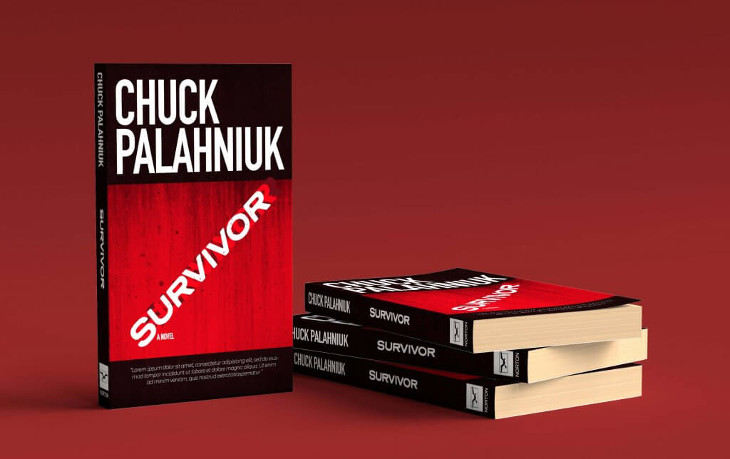
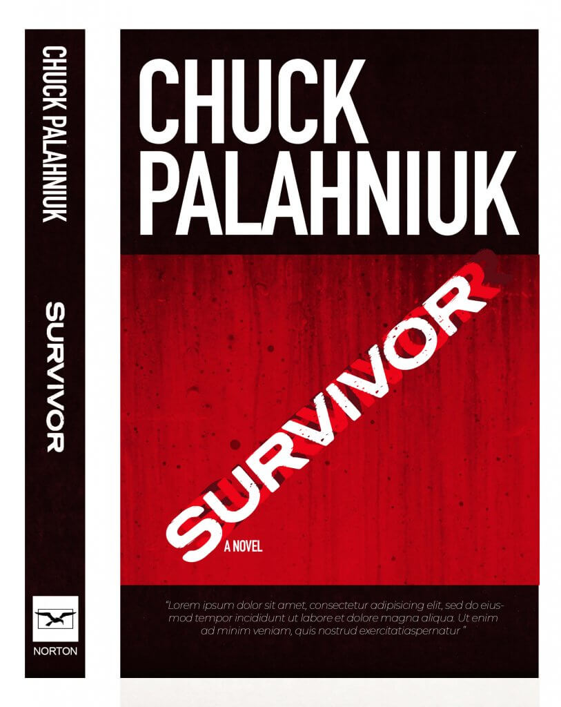
The next imageless cover was a lot trickier, it was hard to make it interesting or even relate to the story, in the end I decided to add the title in at a crashing angle, it looked workable but I still felt it could look more interesting. I added in two more titles and made it look like the title was moving. I kept to the same “danger colour scheme for both.
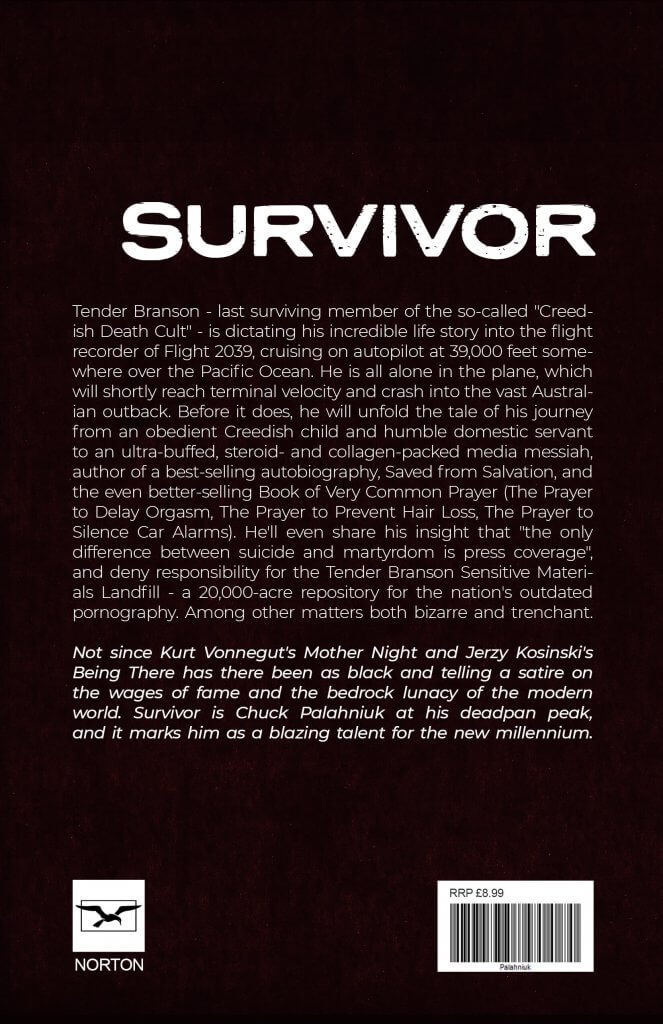
I feel that the book cover with the image works best, I cant think of many times I have seen a book with out some kind of imagery to help it stand out, hard back books with dust jackets removed tend to be plain underneath, I think imagery is important, it does draw our eye over to a book, and if it can tell you what genre of story it is even better.